A website is much more than just pixels, fonts, and pictures. Each website has a unique story behind it, a story that you want to share with your customers and clients. This story sets you apart from your competitors and allows people to fall in love with your brand.
Let’s start with the beginning.
Everything starts with goals and each website has its own purpose. Goals can vary from website to website; it may be generating leads or converting leads to clients. It may be sharing knowledge, presenting products, or informing about an event, or company update.
When we started working on portfolio website, I had a few goals in mind:
- I wanted it to serve as my presentation. I wanted people who visited my portfolio website to get to know me better and understand my experience. I also wanted to easily send a link to my website whenever I needed to share information about myself.
- I wanted to focus more on two relatively new areas for me, consultation and mentorship. So, I wanted people to know that I provide these services and not just design. I also hoped to get new clients for these services through my website.
Even though the goals can be very different, there is something common with great websites. Each of them has a story to tell. We have moved past the time when brands were simply telling people who they are. Nowadays, people tell brands how they see them and how they feel about them. Your brand is not just what you have in your brand book; it is what people think and feel about you. Your role is to guide them and show your brand in the way you want them to see it. And often, it’s not just about what people see, but also about how they feel.
Your website is your opportunity to tell your unique story and help people “feel” you. So, how can you do it?
A great website has THE idea behind it.
Creating a creative website does not start with moving artboards and pixels in Figma, nor does it start with references or mood boards, choosing colors and fonts, or even thinking about the style of the future website. So, you may ask, what do you start with? You start with THE idea.
What is the idea behind your website? Which story do you want to tell? How do you want your users to feel? What will your website be about YOUR BRAND? Start with a brainstorming session to generate ideas and select THE ONE that will help you tell your story.
How do you know if you’ve made the right decision? If you can put the logo and colors of one of your competitors on your website and it still works perfectly, you’ve failed. Each detail on the website should have a purpose and tell YOUR STORY, not someone else’s.
Before starting work on my portfolio website, we had a brainstorming session with the Noomo team. Here are our main findings, thoughts, and ideas.
- As one of the goals was to introduce new services (Consulting and Mentorship), we needed to show me as a person who has the knowledge to share and who can teach and advise.
- My surname in Ukrainian translates to “Natrix,” which means “snake” in Latin. We wanted to include small details on the website that referred to my surname.
- I always love to talk about building experiences beyond just the web, about combining physical and digital. I also believe that things in the physical world are the best inspiration, and we can use them much more in the digital world.”
As a result, we made the following decisions:
1. The first one wasn’t obvious and was inspired by a video I created for my UI/UX design course on Awwwards where I was wearing shorts that looked similar to a kimono. It was the start of the idea that led us to the decision to make the website a little bit Japanese style.
“SENSEI in Japanese is also used as a title of honor for people who teach something and for specialists in their own fields. Medical doctors are included among those specialists. So, you call them SENSEI.”
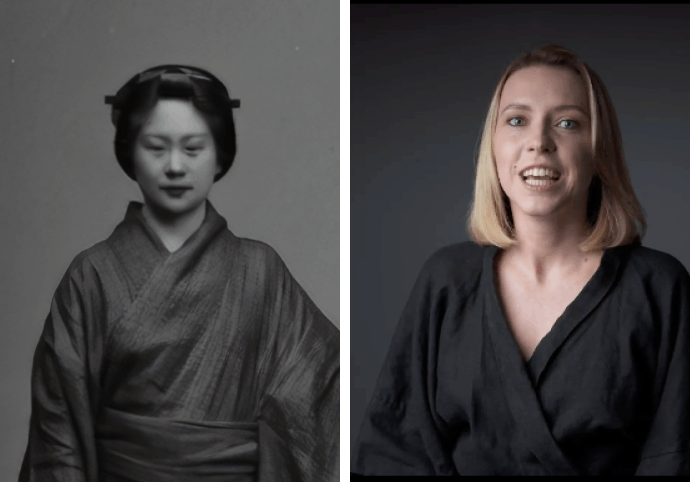 Japanese design inspiration photos showing Sensei concept and cultural references for brand storytelling
“In Japanese schools, teachers use circles (maru (○)) to mark correct answers”
“The Japanese word for circle is enso. It is a universal expression of wholeness that lives deep in our beings.”
More than that, “O” is the first letter of my name.
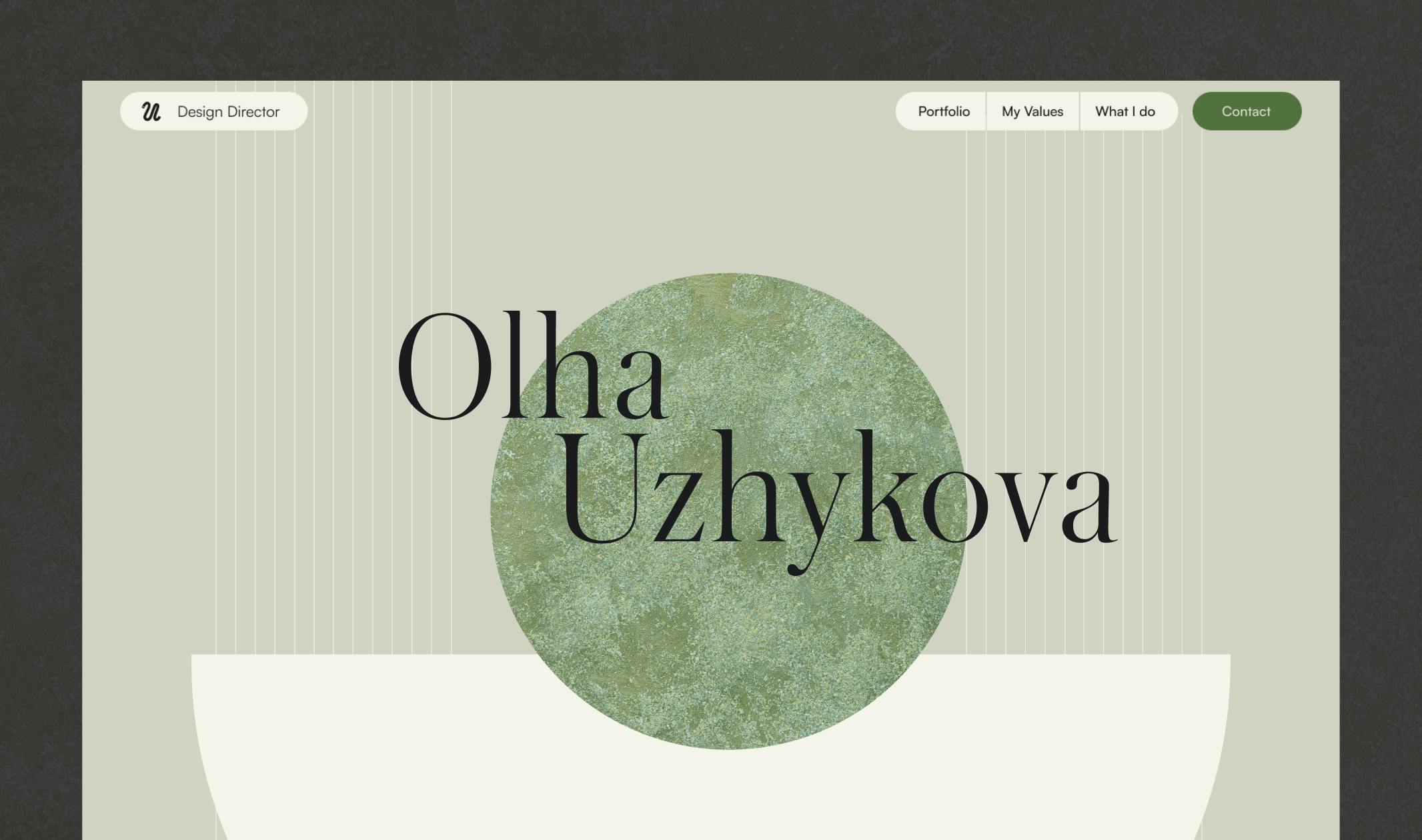
As always, we wanted to go deeper and explore this idea more. As a result, most visuals on my personal website refer to the letters “O” and “U,” which are my initials.
2. The second idea with the snake found its realization in my logo, as well as in the pre-loader and success state in the form.
3. The use of textures was also one of our main decisions. Textures bring physicality to the digital world. I also love the uniqueness of each texture, so there was definitely a place for them on my website.
What about the experience?
As we mentioned previously, feelings are not only about what the user sees; it is much more about their experience. When we talk about great website, it is about how easy it is to navigate, how we respond to each user’s action, and how they can interact with the website.
From the beginning to the end of my portfolio website, we tell a story that we want the user to be engaged with. There were a few decisions that helped us achieve the desired user engagement.
1. The main element on the website is the circle, which follows the user from the beginning, from block to block, guiding them.
2. Engaging but not overwhelming. Animations and interactions always add more uniqueness and help users interact with the content. But it is important not to overwhelm users. Each animation should have a purpose. If there is no purpose for it, remove it. This is why most of our animations respond to the user’s actions, showing them that they can interact with this part of the website and go deeper, like hover animations on cases or on articles.
3. The only animated elements that were not showing to the users possible actions were the animations with the circle and awards.
As for the circle animation, we wanted to keep this idea as a guide on the website, helping users like a teacher. At the same time, the animation in the hero section allowed users to interact with the circle and control it by scrolling, showing the idea that our possible work together will be a relationship where I will always value their input and thoughts.
As for awards, I don’t think that the number of awards shows whether you are a good expert or not. Winning an award is like a game, so I wanted to add playfulness to this block.
Here you can find more how we create animations at Noomo Agency:
- How to create hot animations for any interface
- UI animation guide for After Effects
- Top Principles How to Design Lottie Animations for your Website or App
It is always about details.
From layout to copy, from colors to fonts, from shapes to interactions, great design is always about details. It is about how each element of the website plays together.
Every element on my website has its purpose, and each decision was not a coincidence. One of the best decisions for my website was to “remove borders”. All shapes are positioned in a way that makes it feel like they are floating on an endless canvas. This represents me very well. I do not believe in borders or limitations; I believe that anything is possible if you know your goals and have great people around you.
If we are talking about my portfolio, we made very short descriptions focusing on goals and results. I believe that it is the most important aspect of each project. I could talk for hours about the process behind it, but in the end, the result is the only thing that matters. To measure that result, you need to understand the goals clearly. As for the process, I believe in the uniqueness of each product, and great designers adjust their processes to achieve goals in the most effective way. What works for one product may not work for another, so the result is what you need to focus on.
Do not DESIGN websites, TELL unique stories.
If you want YOUR unique story to be told, you know where to find me and my exceptional Noomo team.
Here you can find award winning website design examples we’ve created:
- Jasmina Denner - an engaging storytelling website that captures the essence of connectivity, linking past, present, and future. Learn more insights in the Case Study.
- Noomo Beat - an immersive 3D AI audiovisual experience for brand activation. Read Case Study.
- Noomo Labs - a highly interactive 3D website with outstanding quality of 3d rendering and animations.
- Noomo ValenTime - an immersive storytelling about love.
- The power of digital storytelling or how to tell the story without words.
- The future of XR - an interactive and fun illustrated storytelling website. (You can find more information about this project in this article Behind the scenes of creating an engaging storytelling website.)
- The Silly Bunny — A highly immersive and interactive website for children’s book, with AR experiences and 3D animations. (You can find more details in our Case Study and do not forget read our article How to create an immersive website with AR and 3D.)
- Cathey & Miles attorneys website - Craft website design for a law firm.
- ITG Digital — a craft and creative website for SaaS product.
- Middle — a fintech website for a game-changing digital platform for the mortgage industry in Australia. (You can find more details in our Case Study)
- OrCad — an enterprise website design built with Webflow. (You can find more details about design process in this article How to effectively implement 3D animation on a website and, of course check our Case Study)
- Check out The best websites that use creative illustrations.
- Learn more about Increasing User Engagement with 3D, AR, and Immersive Web Experiences.
- Elevate marketing and sales by using immersive web experiences.
- How 3D configurators help brands increase engagement and improve user experience.
- Digital storytelling as the main way to tell your brand story.


