


Digital designers often face the challenge of finding new ideas for unique and interactive website design. It may seem that creating an interesting project requires a lot of inspiration, talent, and luck, and maybe even good weather outside. But in reality, there is a certain set of guidelines and an action plan that you can follow to create something original while also solving problems.
Today, our team would like to share the story behind the non-standard design solutions implemented in our agency’s website. We will cover the principles of good website design and provide valuable hints on how to create a unique and creative website design. You can see the result of our efforts on our award-winning digital agency website.
1. Defining goals and the main message
We are a digital design agency that already had a website, which wasn’t bad. However, as we grew, we wanted to highlight our experience, approach, and showcase our capabilities to potential clients. Thus, we needed a new website that would showcase our work and processes while also attracting more clients.
 UI/UX design process diagram showing strategy, research, and creative phases for corporate website development
Let’s start with our goals:
Business goals:
- Increase the number of quality leads from the website by 30% or more;
- Increase the number of quality leads from the website by 30% or more;
- Win SOTD on Awwwards. (Yes we wanted create award winning website design)
These are just the main goals. The more you write them down, the more effectively you will get the result and facilitate the process.
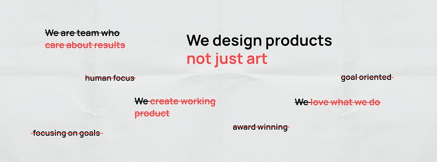
The next thing was to decide on the main message. We already had our slogan — “We create products — not just art”. Also, we were looking for some new options. We wanted it to sound more professional. But during testing on UsabilityHub (we used 5 second test to figure out how clear our message is for users), and also after talking with our existing and potential clients we realized that the slogan perfectly reflects our company. We just changed CREATE to DESIGN. The word “design” allows users to quickly read our line of business. Testing is a great way to remove doubts about controversial points.
 Main message development using UsabilityHub testing for corporate brand positioning and slogan
When you create a slogan, try to answer the key questions — Who are you (your product)? Why are you better than others? The answers to these questions will especially help you when working on the UI part.
So…
We defined goals.
Analysed existing website.
Prioretzed tasks.
Finalized the key message.
2. Mood board. Brainstorm.
 Creative mood board collage with paper textures and design inspiration for agency website redesign
“If you don’t know how to start, start with a mood board. Don’t know what to do next — brainstorm.“
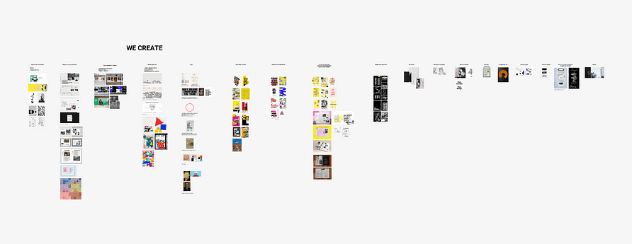
It’s easier to start with competitor analysis. Always look at what others have. Thanks to Awwwards, Dribbble, Pinterest it is easy to find a selection of good creative websites. But don`t restrict yourself to only looking at other websites. There are a lot of different ways to find inspiration for your website design. We were inspired by posters, publishing products, photographs, illustrations, and even paper notes. We created a separate file for brainstorming, uploading different images, photos, screenshots, and writing ideas.
As you sketch out ideas, gradually you will notice that some of them are similar. Try to unite them into groups. This will give you a certain number of themes for your interface. There can be 3–5 main ideas.
We decided to brainstorm with our team of UI/UX designers where everyone wrote down their ideas about how we can show who we are in the best way. After that, we combined similar ones having around 12 different groups.
 Team brainstorming session with sticky notes organizing design concepts for corporate website
How do you know which creative idea is the one?
Brainstorm, share your ideas with your team, potential users, clients, or even friends. See how they will react to this or that idea. After the presentation to the team, we made a poll and thus identified 3 further directions for ourselves.
3. Define website style. User testing.
“The style of your UI should emphasize the main idea, help the user to intuitively read your message.”
Key points we wanted to show on the website:
- We design digital products;
- We design digital products;
- We believe that there is a lot of work behind a quality product.
Where does UI/UX design begin? It starts with defining goals, conducting research, and generating ideas. You don’t need Figma or Sketch for this — all you need is a piece of paper and a pen. Good UX is the foundation of a good product, and wireframes can help you work it out effectively. Moreover, it’s important to consider what clients notice first: in our case it is our work.
After brainstorming, we settled on three ideas.
1. “Wireframe” style — the finished design hides a well-developed idea;
2. Paper — it all starts with a blank piece of paper, notes, ideas;
3. Portfolio (Album of works)— to make the main focus on our design projects.
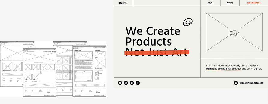 Wireframe-style website design concept showing UX foundation and structural thinking approach
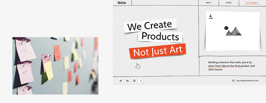 Paper-inspired website design with handwritten notes and sketch aesthetics for creative agency
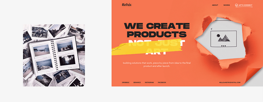 Portfolio album layout showcasing project case studies with visual hierarchy and storytelling
You can always mix and blend your ideas, and that’s exactly what we did. We combined the three ideas we mentioned earlier into a single idea. Read on to find out which specific ideas we incorporated.
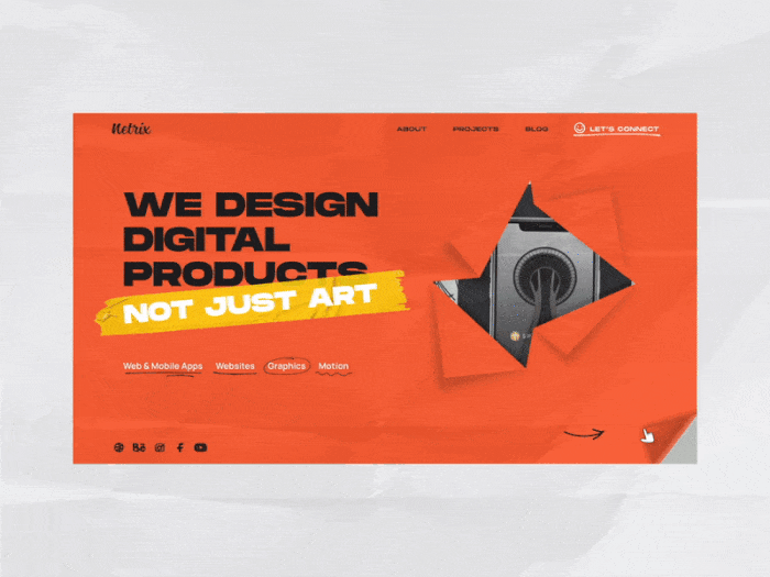
All design starts with a blank sheet of paper. Then you proceed to some quick sketches and notes. These physical elements we brought to our website. Our website is like a working design notebook with notes, ideas, sketches. To emphasize it we added hand-written underlines, elements with crumpled paper texture, realistic shadows, and animations.
Then came one of the most challenging questions: which banner would best convey our main message? We considered using the pyramid from the previous version of our website to represent how we build solutions. Alternatively, we thought about displaying wireframes in a hole to emphasize that there’s always a massive amount of work behind every beautiful project.
 Banner design concepts exploration including pyramid structure and wireframe reveal animations
However, none of these options conveyed our message as effectively as we wanted. We continued to ponder the ideal way to present our work, and then inspiration struck — bingo! There’s nothing that showcases our expertise and abilities better than the projects we’ve completed. They are the core of our work and not just for show.
Therefore, the banner we chose features a torn-up cover, symbolizing the unveiling of our projects and the message they speak about us. It’s a powerful representation of our capabilities and what sets us apart.
4. Importance of details for interactive website design
Details are the key for creative website design. Details it is what makes the design interesting and makes users spend more time interacting with the website.
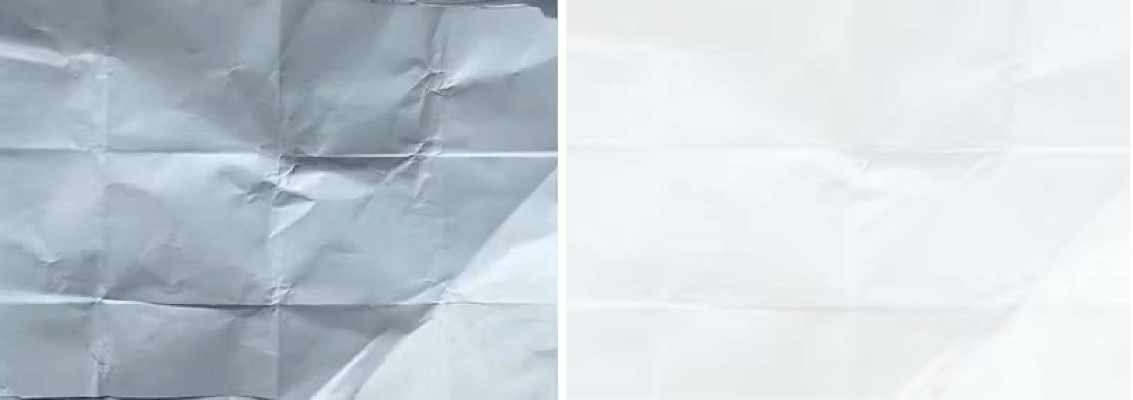 Photographed crumpled paper textures creating tactile background for interactive website design
We tried to create as many elements as possible by hand. We photographed, edited, and used a crumpled sheet of paper as the main background. Arrows, icons, and illustrations were also hand-drawn. Hand-drawn style is a great way when you can’t draw. Less straight lines make the cutest illustrations. Don’t you agree?
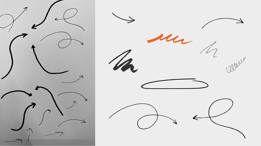 Hand-drawn arrows and UI elements adding personal touch to corporate website interface
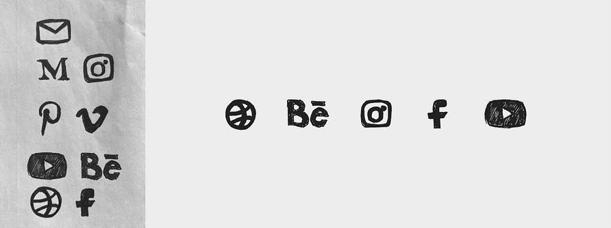 Handcrafted social media icons with sketch aesthetic for authentic brand personality
 Custom hand-drawn illustrations bringing warmth and personality to professional website design
Each member of our team has their own totem emoji. We put them on the project card, showing which team members were working on the project. Small UI details make a lot of sense.
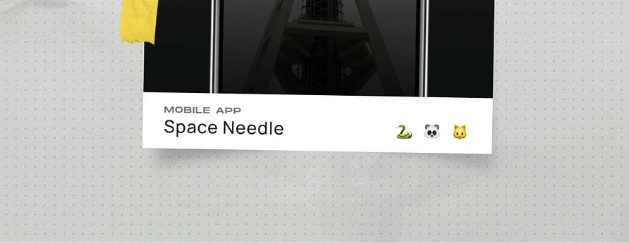 Team member totem emoji icons showing project contributors with playful personalization
Piece by piece, you create your design concept like a puzzle.
And there were quite a few unusual tasks we faced:
- how to flip the cover on the home page;
- how to flip the cover on the home page;
- how to make a transparent hole on the main screen that will look transparent while moving.
 Interactive cover flip animation revealing portfolio projects with torn paper effect and realistic physics
5. How to make creative and realistic animations for the website
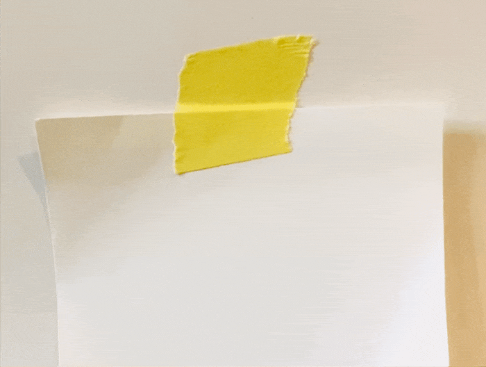
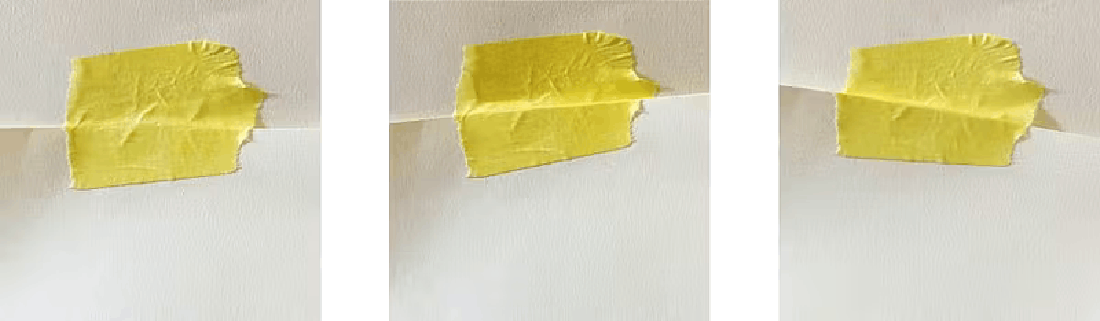
We wanted the effect of shadows and the paper moving while scrolling and flipping the cover, to be realistic. Therefore, we took the real adhesive tape and paper and recorded the shadows moving, and the adhesive tape breaking.
 Real adhesive tape and shadow testing for authentic scroll animation physics reference
To achieve the most realistic effect while scrolling, we needed to create three different states of the adhesive tape: when scrolling left, scrolling right, and for the static position. To do this, we created three distinct images of the adhesive tape in different positions, which were then incorporated into the website.
 Three-state adhesive tape animation showing left scroll, right scroll, and static positions for realism
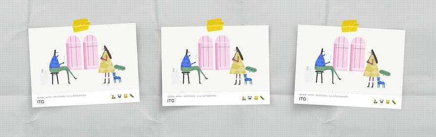 Portfolio card hover animations with paper texture and shadow effects for interactive engagement
Here you can find more how we create animations at Noomo Agency:
- How to create hot animations for any interface
- How to create hot animations for any interface
- UI animation guide for After Effects
6. The good quality of content is the top priority for a website
A corporate website is more than just a collection of images — it’s primarily about the content that users are looking for. This includes presenting yourself, your company, or your product and sharing your philosophy, approach, and what sets you apart. It’s also essential to describe the services you provide and your areas of expertise.
For a design agency website, nothing speaks louder than your work. We made sure to describe each of our projects in detail, including the challenges we faced, the goals we achieved, the processes we employed, and the solutions we developed, along with the results we obtained. When creating your portfolio, it’s important to spend some time giving context to each project. Without context and goals, a pretty (or not so pretty) picture is all you’ll end up with in the end.
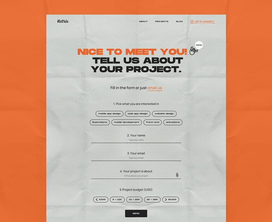 Redesigned contact form with comprehensive fields increasing lead quality by 55 percent
In addition, we revamped our old contact form to make it more comprehensive and gather additional information about each request. This enables us to provide better assistance to users right from the start. You may assume that having more fields would result in fewer requests, but this is not the case. In fact, our new contact form has increased the number of requests we receive by 55% compared to the old one, which only had two fields.
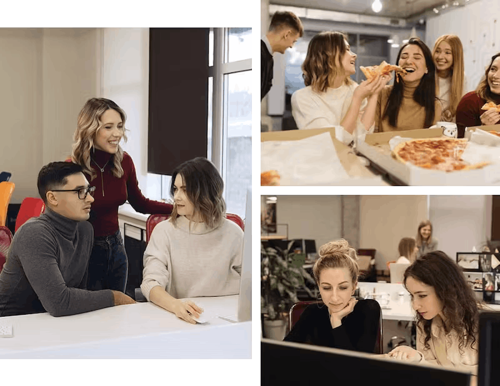 Professional team photo shoot showing design agency culture and collaborative work environment
When designing a corporate website, it’s crucial to pay attention to the photo content. At Noomo design agency we believe that everything revolves around people. We’re a team of UI/UX designers and problem-solvers working every day to simplify our clients’ lives. That’s why we organized a team photo shoot and captured our working process, so our clients and potential employees could get to know us better. It’s important to present your company since most clients interested in collaboration often visit the About Us page first.
7. Design implementation
Excellent design implementation needs good communication between the motion designer, UI/UX designer, and developer, especially when working with unusual designs. It’s a good idea to come up with several ideas because some may not be possible to implement due to the difficulty or resources needed.
To streamline the development process, we initially created the flip animation in After Effects. We then implemented it using a combination of Lottie and code. We also used Lottie to create all the illustrations and hovers.
It took a lot of time to optimize the animation. Our priority was to have a website that is loading fast. Remember, no matter how beautiful animations you use, if your site takes too long to load and everything slows down, then more users will leave it.
Please, don’t forget to pay attention to other pages and elements, and make them interesting, such as an Error page, a Thank you message, a Favicon, an Open graph image for the sharing link. Great design is in details.
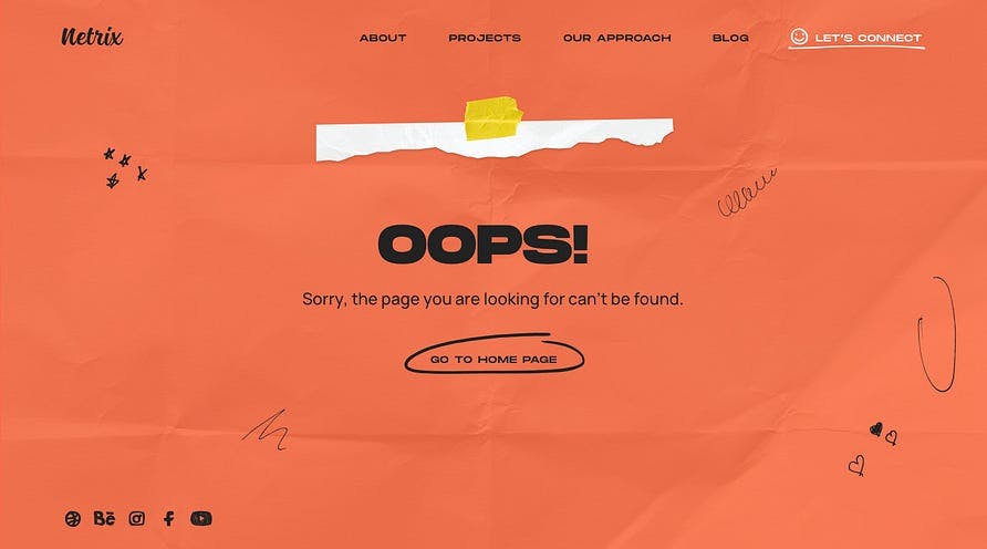 Creative 404 error page design with hand-drawn illustration maintaining brand personality
Results
What did we get in the end? Are we satisfied with the result? Have we achieved the main goals? We would say, yes! We increased the number of leads (good leads) from our website. We won the Awwwards Site of the Day, Developer Award, Mobile of the Week Award, and Mobile Excellence. More than that it helps to attract new employees. We learned that it was important for them to have a cool corporate website for the company in which they would like to work.
Hints to create interactive website design
So… you are thinking about updating your current website. Here is a list of hints that may help you create creative and award winning website design:
- The first and the most important one: answer the question: Why do you want to do a redesign?
- Set up goals. (Goals should be achievable, countable, and have a deadline).
- Make a list of what you don’t like about the existing website.
- Be sure that you know your users.
- Define the main message, idea, what you want to say on your website.
- Create the structure of the website and pages.
- Find references, analyze competitors.
- Brainstorm with team, clients, or friends to generate and choose top design ideas.
- Test your ideas on the target audience.
- Pay attention to the content. This is the most important part of the website.
- Communicate closely with the development team.
- Launch.
- Analyze.
- Make improvements.
- Never stop.
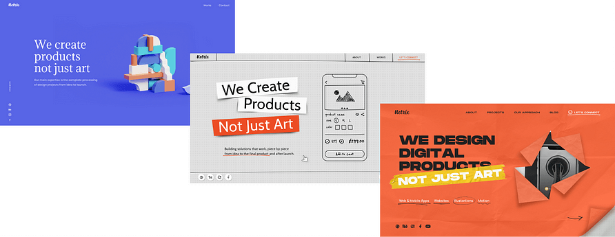
Here you can find award winning website design examples we’ve created:
- Our design Director Olha portfolio website (You can find more details about design process in this article Beyond Pixels and Code: Crafting your unique story trough creative website design.)
- OrCad — an enterprise website design built with Webflow. (You can find more details about design process in this article How to effectively implement 3D animation on a website.)
- Learn more about Increasing User Engagement with 3D, AR, and Immersive Web Experiences.
- Elevate marketing and sales by using immersive web experiences.
- Check out The best websites that use creative illustrations.