Why you should use animations in interfaces?
Using animations in design can make your interface more interactive. We have dozens of examples where creative animations elevated the app or website design to the next level. And we are gonna to share with you coolest web design animations as well as interactive animations for app design.
Our beloved ITG illustrations landing page — animations in web design.
We often incorporate animations in our interface design, ranging from interactive animated banners to small details like barking dogs in the footer.
AI eye-tracking application — animations for app design.
For this training mobile application, we introduced a main character to assist users in completing exercises and guiding them through the login and registration process, incorporating best UX design practices for using loading animations. Additionally, we added small interface design animations for exercise-type cards.
Bluebird website — interface design animations.
This example doesn’t use character-based animations, but it still demonstrates an interesting use of animation in website design. The banner animation and city icon animations in the contacts block are simple yet effective, making the website look more detailed and polished.
Animation basics and best practices for using animations in design.
First, consider the goal of your animation. What are you planning to animate? Will it be a banner illustration for a website, small icons, or onboarding illustrations for an app?
Duration
For banner animations, it’s best to keep them under 10 seconds. Since people don’t spend much time on the banner, a long animation, no matter how cool it is, will probably go unnoticed.
Additionally, keep in mind that the longer your animation is, the larger the final file size will be. This can cause issues with implementation and slow down loading speeds.
Smaller animations on the website: keep them 4–6-sec max and make them looped. That way they will load fast and look nice on the website.
The same principle works for app animations. They have to be small and looped to look good and work well.
Bluebird icons animation
Icons: 3–4 seconds of animation will be more than enough. For most cases, you will only need to reveal some basic animation for icons. However, there may be times when you want a more complex and looped animation.
Technical specifics
Frame rate
We recommend using 30 fps for your animation. Even though the standard frame rate for the web is 60 fps, 30 fps works better — animation looks more smooth and weighs less.
File format
You can use 3 types of files for your websites and apps: gif, mp4, and Lottie JSON.
If you compare these formats by their file sizes and quality, it will look something like this: Lottie animation is the smallest and has the best quality. MP4 animation weighs a little bit more and has lower quality. GIFs have a large file size and poor quality.
GIF
A non-static image format that can be easily used everywhere: on a website, in a mobile app, social media materials, or even sent to your friend as a sticker.
- In this format, you will have a transparent background which isn’t possible in mp4 format.
- This format will be suitable for you with small-sized compositions or single elements.
- Better not to use it for big ones because the file size might be too big and its quality is not so good compared to mp4 and Lottie formats.
MP4
It’s the most common video format.
- Compared to gif mp4 has a good quality and a smaller file size. It’s easy to use on your websites and apps.
- You can’t have a transparent background in this format so keep that in mind if you want an animation for a website banner or something else with a color background.
Lottie JSON
A Lottie is a JSON-based animation file format that you can use on any platform as easily as static assets. They are small files that work on any device and can scale up or down without pixelation.
- Jason is the most flexible format. If you choose Lottie Json, you get the opportunity to change some settings like animation speed, background color, animation on hover, loop animation, etc. via Lottie web player.
- To implement a Lottie file on your resource just give it to your developer or use the Lottie file player to generate the code.
- Lottie format is suitable for such platforms as Windows, iOS, Android, native script, xamarin, react native, angular, flutter, qt, skia, and vue.js
We recommend using a Lottie format for animations. This way your animation 100% will be of decent quality, you will have a transparent background, and implement animations easily on lots of platforms.
If you don’t want to spend a lot of time on the animation, but you want to test Lottie animations — we prepared a lot of FREE animations for you.
4 categories in 2 different styles. You can download full compositions or only elements from them.
Check our website for free animations you can use in your design and grab your free Lottie animation right now!
Animation ideas and design part.
When brainstorming animation ideas, keep in mind everything listed above regarding duration, loops, and file size. Here, we’re sharing some ideas on the creation process, and we hope they will be helpful to you.
- Think about the main goal of the animation. What story do you need to tell with it? What should the user feel and think while watching?
- Imagine how the main elements of the illustrations will look. What will represent your story — characters or abstract elements?
- Brainstorm ideas. Never begin to design or animate if you have only one idea for it. Write down a couple of options, and list their pros and cons. Only after that choose the one you will work on.
- Write down a detailed plan if you have a big story to animate. That will help you plan your work better, so you don’t end up with a long and confusing animation.
- Work on the style. Collaborate with an illustrator or do it yourself. It’s important to consider the final output format at this stage because if you use some heavy textures or even embedded AE effects, they might not work in Lottie.
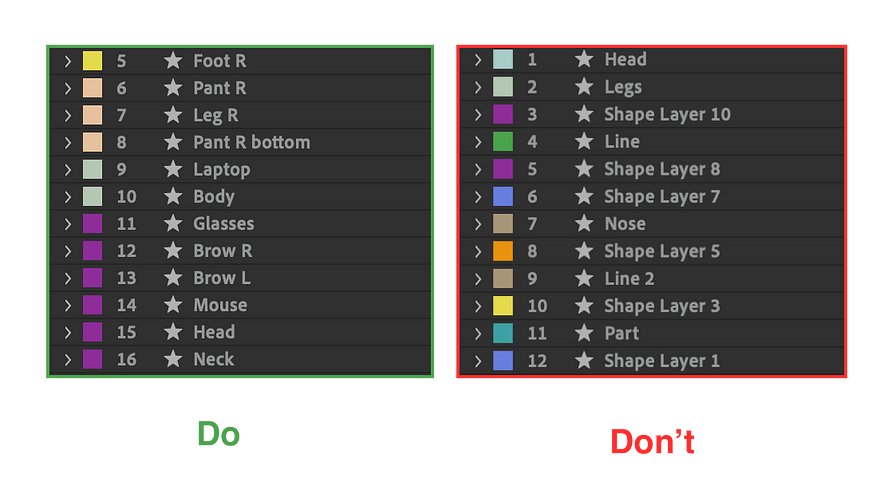
- Do your homework. Name all the layers properly, and split all the elements that will be animated into the different layers.
Animation process recommendations how to use them in design.
Before you start preparing your illustrations for the animation, you can use graph editors to prepare them in After Effects, where the illustrations were created.
 Looped icon animation example for website interface showing 3-4 second cycle
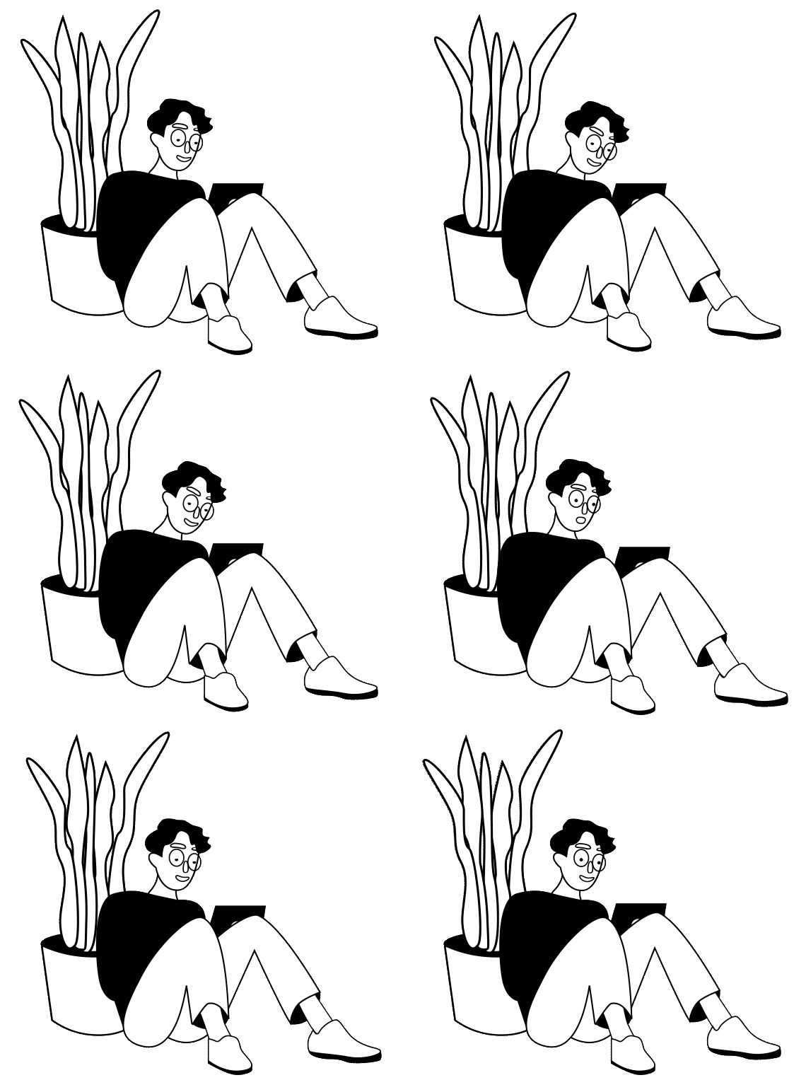
For example, we take this smart guy from our free Lottie animations.
- Split body parts into different layers and give them proper names
 Lottie web player interface for testing animation playback in SVG and canvas modes
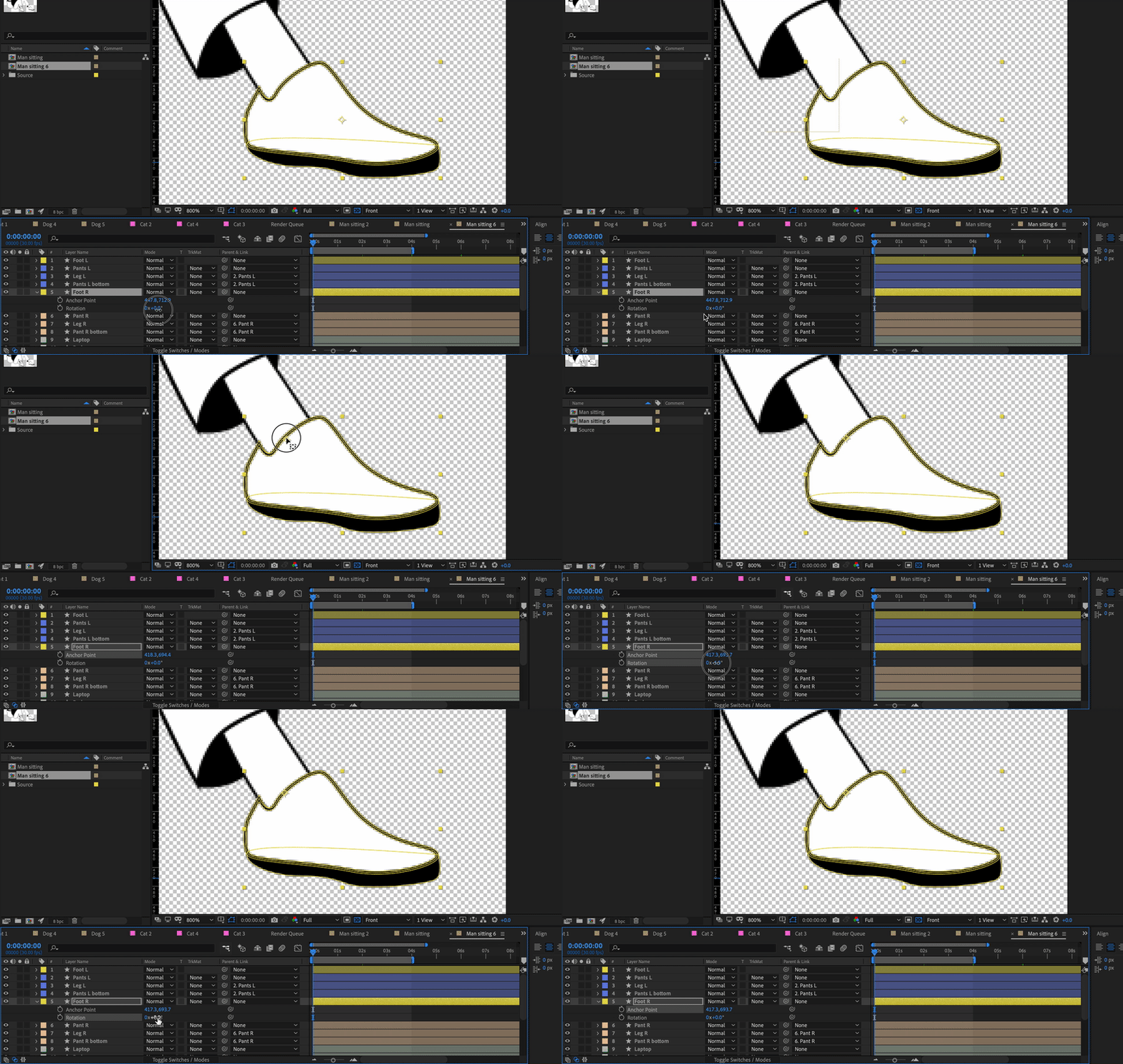
2. Align anchor points
 Bodymovin plugin export settings for Lottie JSON with transparent background and asset management
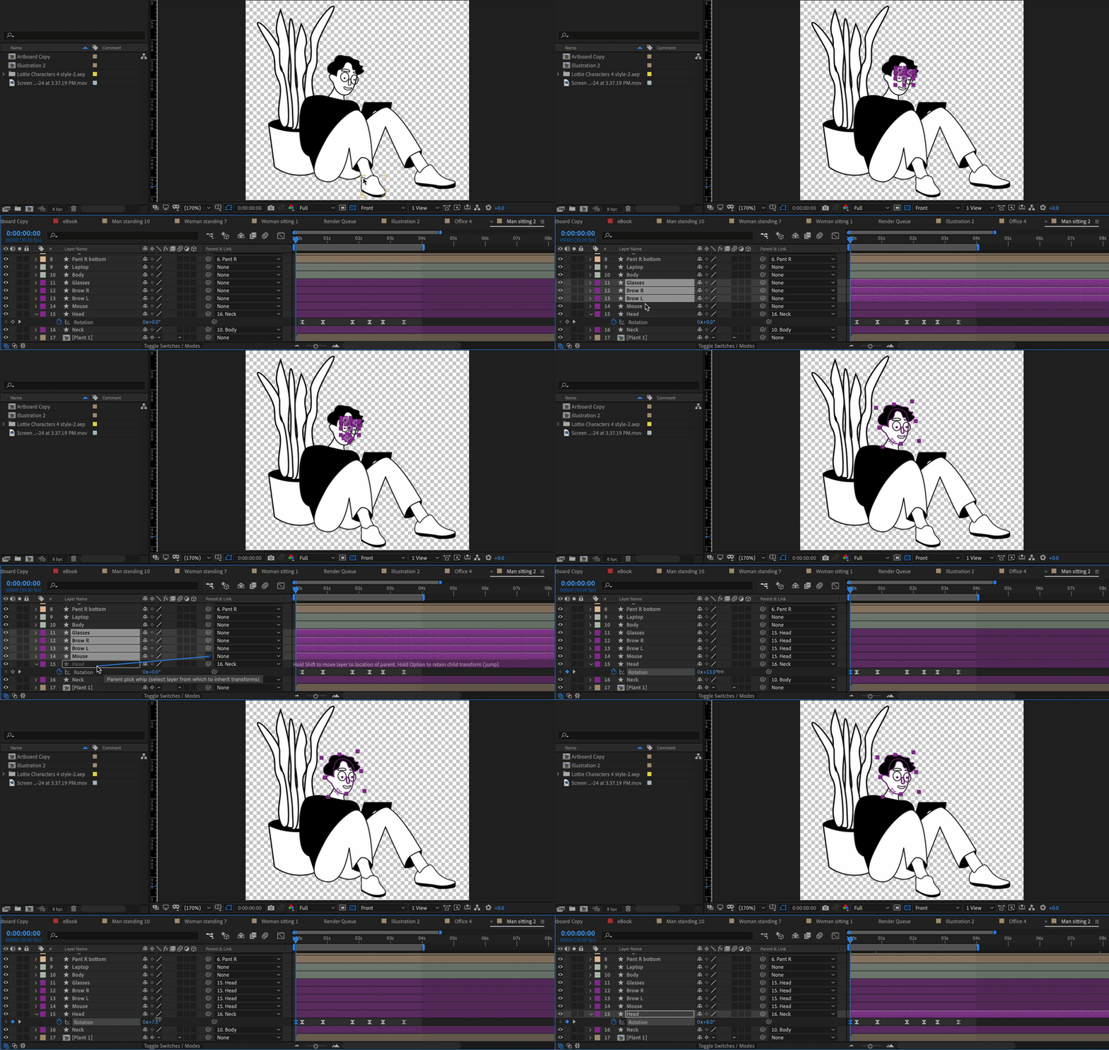
3. Parent layers
 Lottie web player interface for testing animation playback in SVG and canvas modes
Lottie hacks.
We use Lottie in our work all the time so we prepared some hacks for you.
- Merge path
Sometimes it works, sometimes it doesn’t. So, in this case, it’s better not to take the risk. - Masks
Don’t create a mask using the track mate. That probably won’t work in most cases. Create masks on the layer using a pan tool or shapes to add masks.
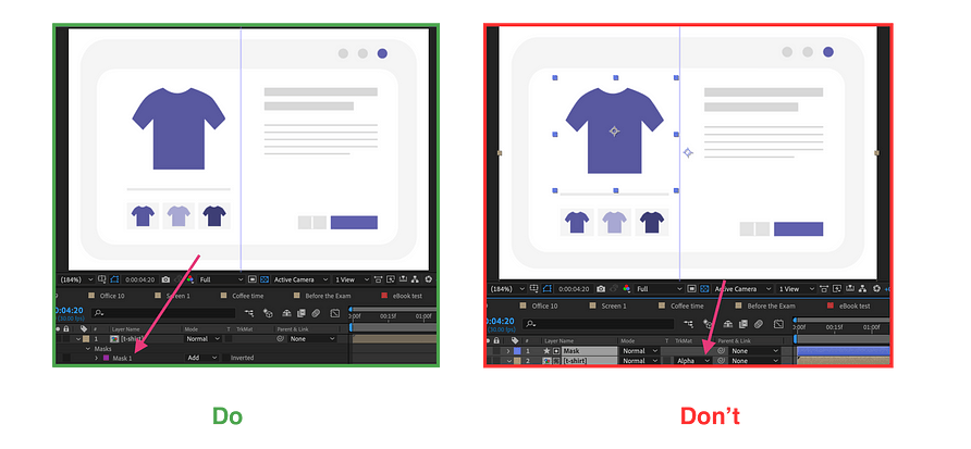 Webflow Lottie animation integration showing drag-and-drop implementation for websites
Rigging instruments
They either won’t work or will make your JSON weigh more, which will be bad for the implementation. Duik, Limber, Ruber hose won’t be your friends in this case.
Rig characters using parenting. This way your animation will definitely work in the Lottie format.
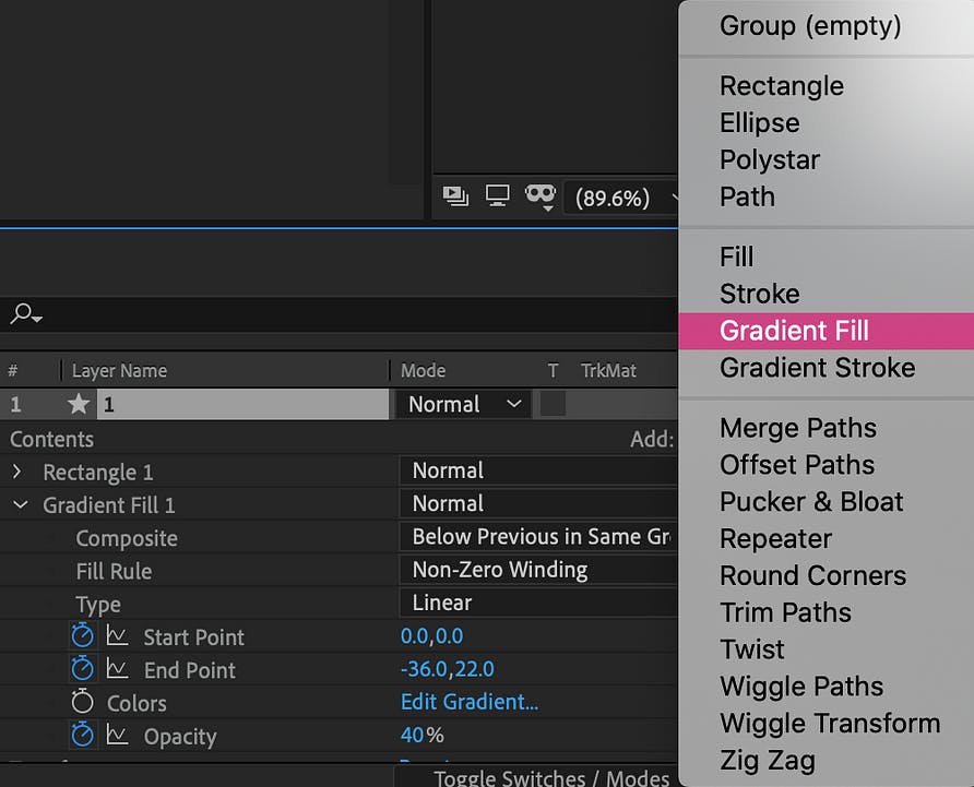
Gradients
 Optimized composition canvas size for Lottie export reducing file weight and loading time
Here are some small tricks for using gradients in the Lottie format: You can use gradients if you add them as a layer modifier. This way, you can animate the start and end points of the gradient, as well as its opacity, in the JSON file. Note that animating the colors of the gradient won’t work.
- Composition size
Try not to leave a lot of free canvas space on your compositions. Make them as small as possible. Also, don’t forget to center and align them to the bottom for easy implementation. - Layers
Try not to create too many layers in your compositions. In this case, less is better. If you have many animated or even static layers, the final file size will be larger, and you may encounter problems with the loading process.
Prepare for the animations implementation.
- Check that you don’t have masks, effects, or merge pass on the layers.
- Remove background, go to a transparent view, and check that everything works right.
- Check body moving settings.
Uncheck the “Glyphs” option if you don’t have any fonts. Choose the “Demo” file if you want an HTML file. Choose “include in JSON” in “Assets panel” if there are pictures in your file. - Upload JSON file to the web-player and check the animation in SVG and canvas mode.
That’s all! Now you can forward your animation to the developer or implement it yourself.
Using Lottie animations in website builders.
If you don’t want to create your own animations but have found cool ones on ITG or Lottie files, what can you do with them?
Insert into Webflow or Elementor straight away.
P.S. You can go through the detailed instructions via the links above.
OR
Use Lottie web-player to change background color, speed of the animation, make it start on hover or loop animation. Then generate the code with one click and use it via Readymag or straight on your website.
Conclusion.
- Take your time to think about animation ideas. Always keep in mind the main goal of the animation and technical requirements.
- Use Lottie for better quality and a smaller file size.
- Don’t use effects for design or in the animation, so your animation would 100% work after the implementation.
- Don’t forget to check the animation for bugs before implementing it on the Lottie web-player or Lottie files website
Hope our suggestions helped you! Don’t be afraid to use animations in your work. They definitely make a big difference.
Here you can find the best animated websites examples we've created at Noomo:
- Our design Director Olha portfolio website (You can find more details about design process in this article Beyond Pixels and Code: Crafting your unique story trough creative website design.
- The Silly Bunny — A highly immersive and interactive website for children’s book, with AR experiences and 3D animations. Awwwards and CSS Design award winner as one of best book website design.
- ITG Digital — a craft and creative website for SaaS product. RedDot winner for best Web Services & Applications design.
- Middle — a fintech website for a game-changing digital platform for the mortgage industry in Australia. The best financial services and banking website 2023 according to Webby Peoples Voice. (You can find more about this project in our Case Study)
- OrCad — an enterprise website design built with Webflow. (You can find more details about design process in this article How to effectively implement 3D animation on a website.)


