


As someone who has seen firsthand how a poorly maintained typography system can lead to disaster, we can attest to the importance of keeping it in order from the very beginning of a project. You never know how big a project will become in the future, so it’s crucial to consider scalability when designing elements.
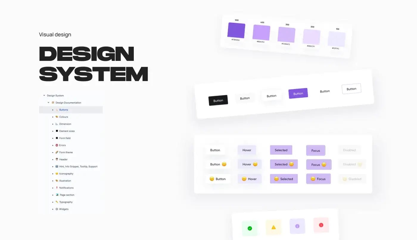 Design system.
We’d like to share a bit about how we managed a typography system that was originally intended for just the company website, but ended up being used for multiple products. It was a challenging task, but by keeping the system flexible and well-maintained, we were able to make it work for all of our products. We hope this information is helpful and gives you some insight into the importance of maintaining a strong typography system in your own work.
The design project begins.
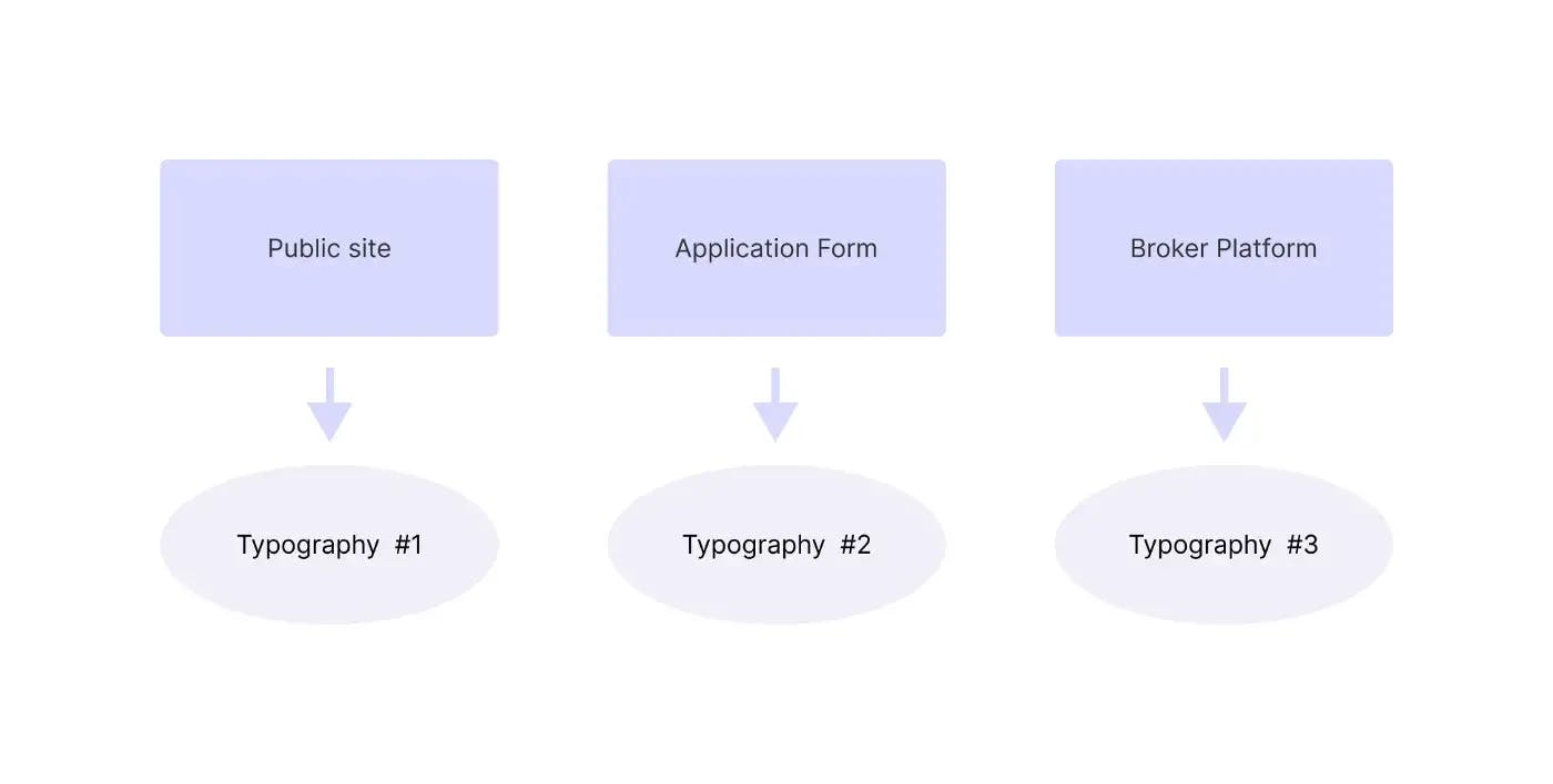
As with most design projects, we started our work on the company website, where the typography was made up of six headings, two types of body text, links, and a set of rules for usage. We also took into consideration the responsiveness of the typography.
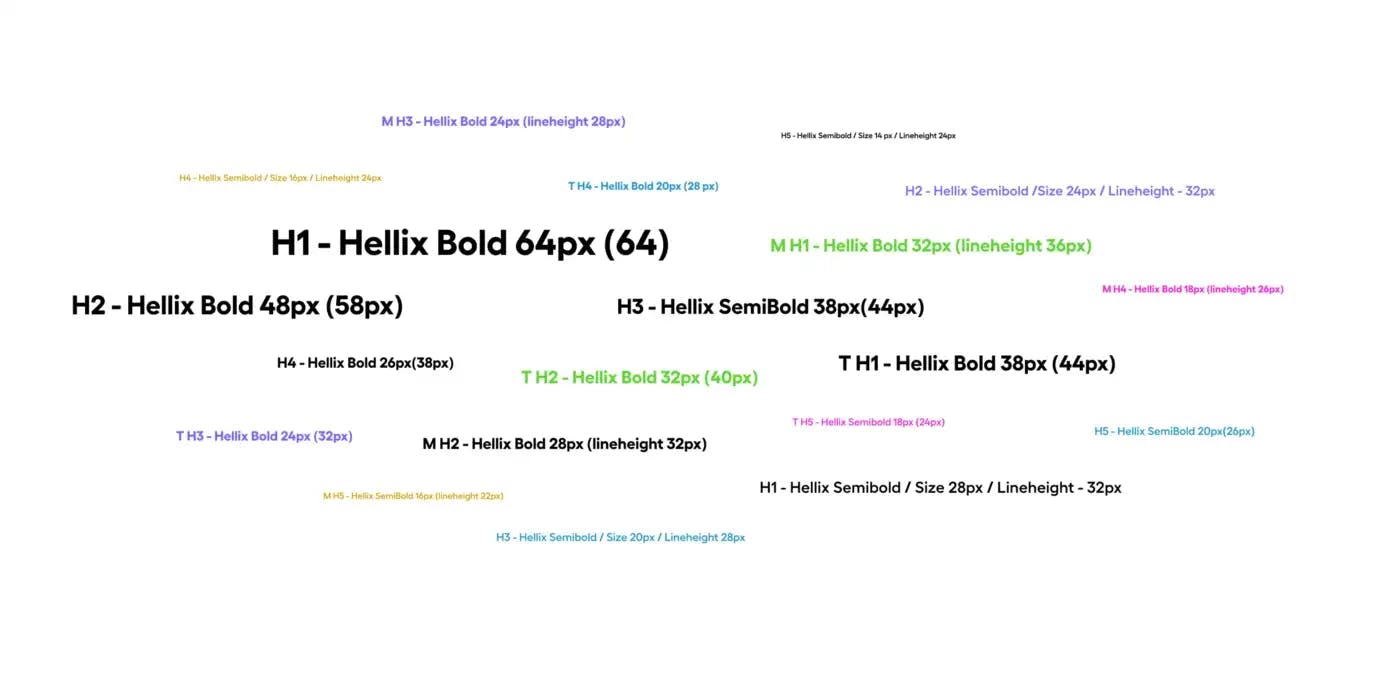
 Typography hierarhy in design system.
However, as we moved on to designing the application form, which had a lot of complex design elements and slightly different typography, we quickly realized that the typography system we had in place for the company website wasn’t sufficient. So, we decided to create a second typography system to better accommodate the needs of the application form.
It made sense at the time to have two separate typography systems, but as we began work on a third product — the broker platform — based on the same UI style, we realized that we needed to create yet another typography kit. This was frustrating, as it meant we had to come up with different (or slightly different) logic for each new system. 😦
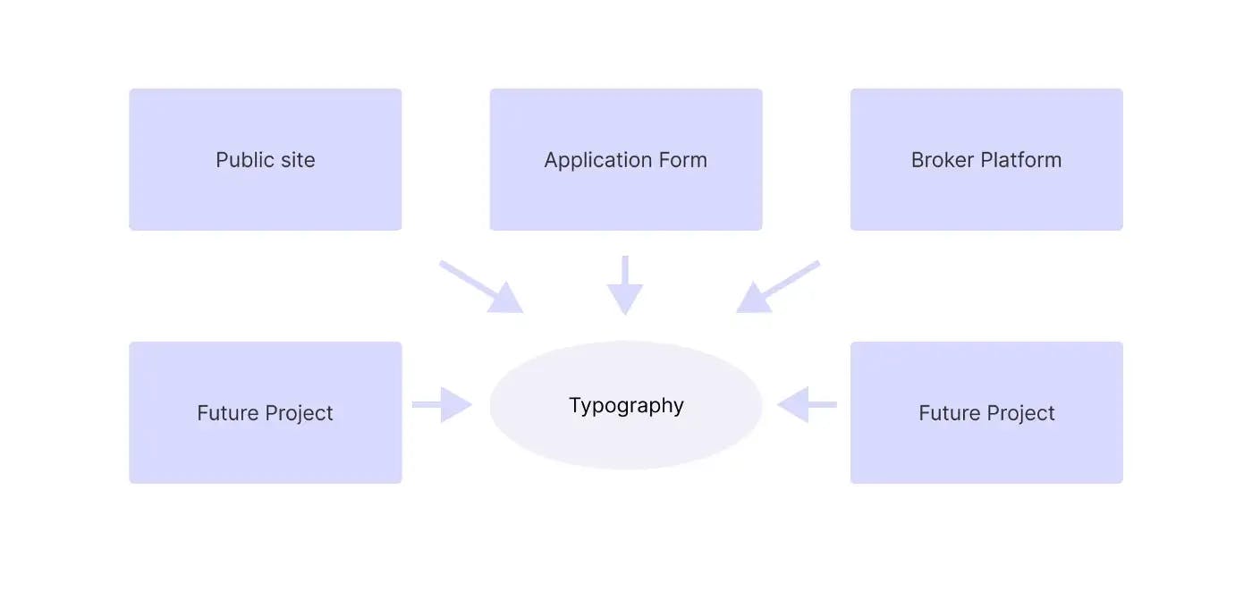
To streamline our design process and reduce confusion, we decided to merge all the styles into one comprehensive typography system and create flexible rules that could be applied to any number of products, whether websites or platforms.
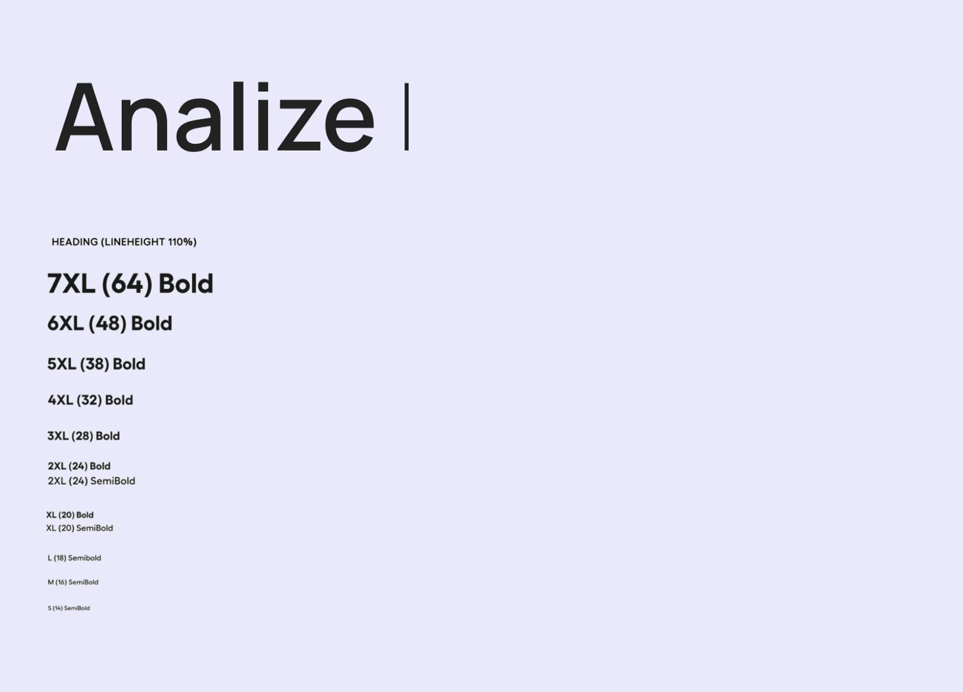
The analysis.
Our primary objective was to create a multipurpose typography system that wouldn’t compromise the integrity of our current design. To do this, we gathered all of our declared font styles and began analyzing them as a whole.
Problem 1: Line height inconsistency.
As we were working as a team of three UI/UX designers, it was not uncommon for each of us to put our own spin on the font system. This led to lineheight inconsistency, but it also helped us to realize the importance of knowing exactly where and how a specific font style will be used, and declaring it accordingly for those specific purposes
Problem 2: Responsive inconsistency across products.
We noticed that fonts of the same size appeared smaller in the responsive typography for the public website, but larger in the responsive typography for the customer platform. This created different sets of rules for how to use the font on each product, leading to inconsistency in the responsive design.
Key insights:
Our experience with lineheight inconsistency and responsive inconsistency across products led us to consider the specific requirements for a font system, including:
- A logical system of lineheights.
- A logical system of lineheights.
- A consistent responsive system for the font styles.
Solution
1. A comprehensive list of font styles for all current and future products.
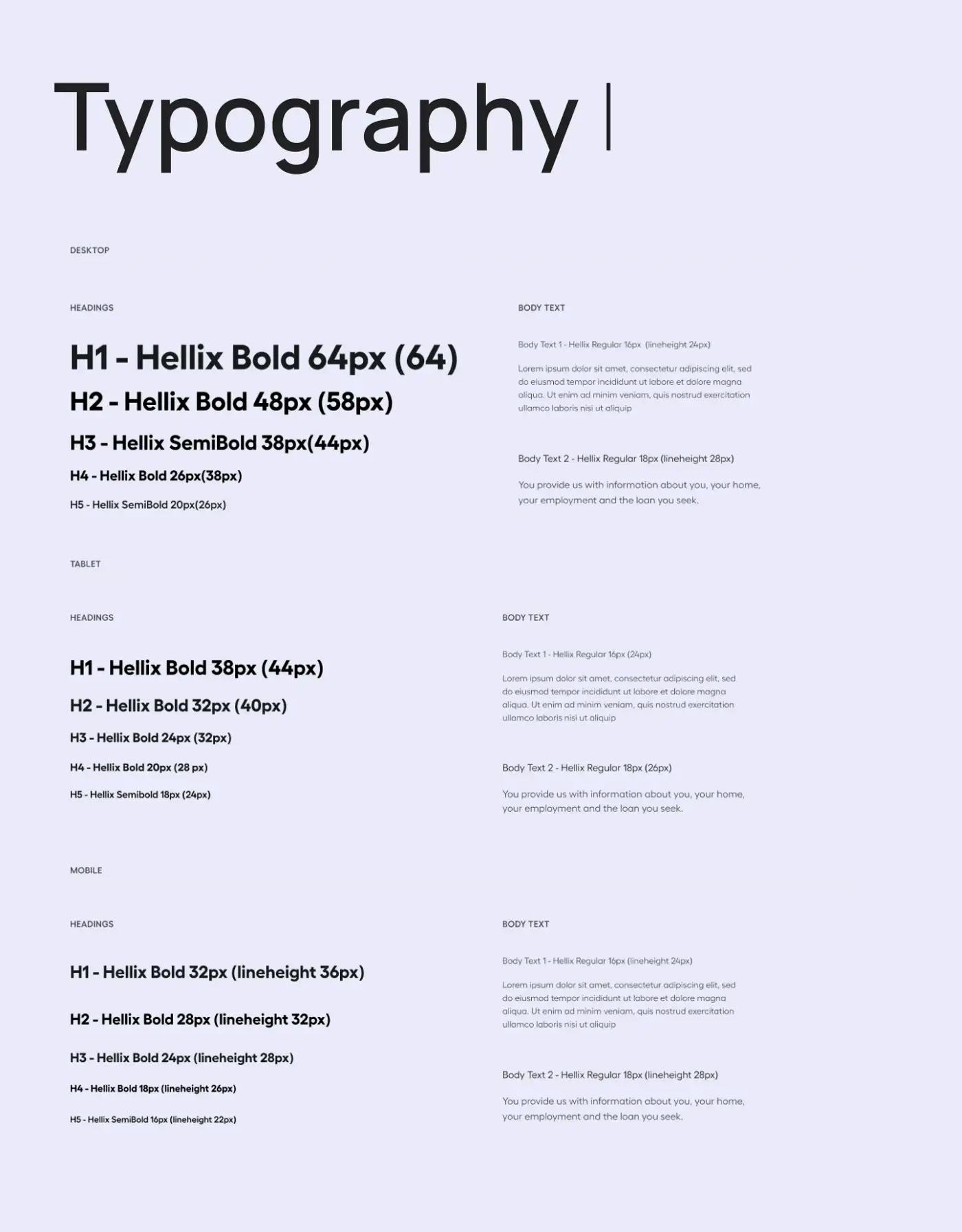
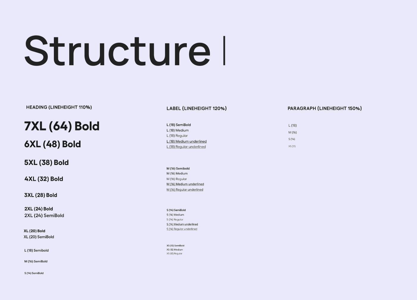
To begin with, we created tokens for headers. After analyzing the fonts, we realized that by merging several similar or slightly similar font sizes into one, we could reduce the number of unique styles while still maintaining the creativity and aesthetic of our design. We listed out all of our font styles and assigned names ranging from “S” to “7XL” to them. This way, we were able to create a list of 6 headers that would meet all of our needs for future projects.
2. A logical system of line heights.
Previously, we had only two categories for text styles: headers and paragraphs. However, we found that we often created additional text styles when the existing ones didn’t look well-balanced in certain contexts. For example, we would use a different style in inputs, buttons, or chips because the lineheight of the paragraph style was too large. To address this issue, we decided to split our styles into three groups based on their intended purpose and use lineheight in percentage for each group:
- Headers (lineheight 110%): used for headers and subheaders of page sections
- Headers (lineheight 110%): used for headers and subheaders of page sections
- Paragraphs (lineheight 150%): used for body text of page sections, typically four to five lines of text.”
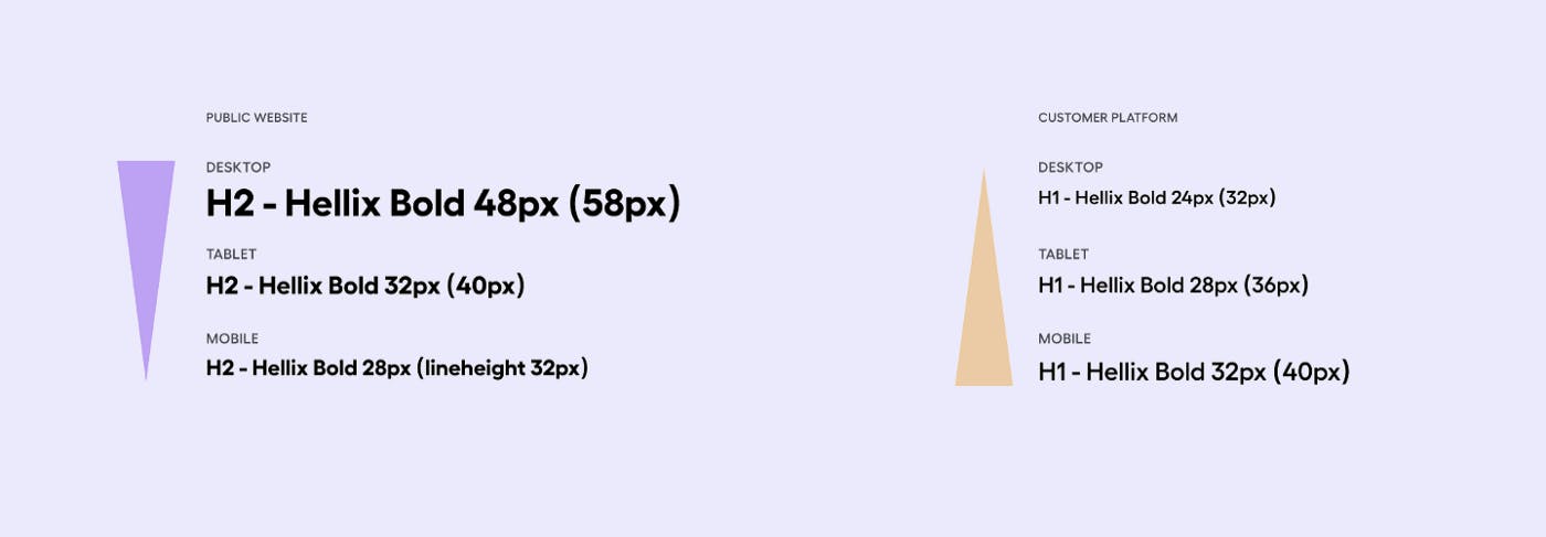
3. Consistent breakpoint hierarchy.

It’s important to have a consistent breakpoint hierarchy when designing a website or product. This ensures that the same typography is used for the same titles across different screens and devices.
For example:
Page title on desktop = h1/desktop (heading-7xl)
Page title on tablet = h1/tablet (heading-5xl)
Page title on mobile = h1/mobile ((heading-4xl)
By following this structure, designers can easily reference the correct typography for each product and ensure that the design is consistent and responsive.
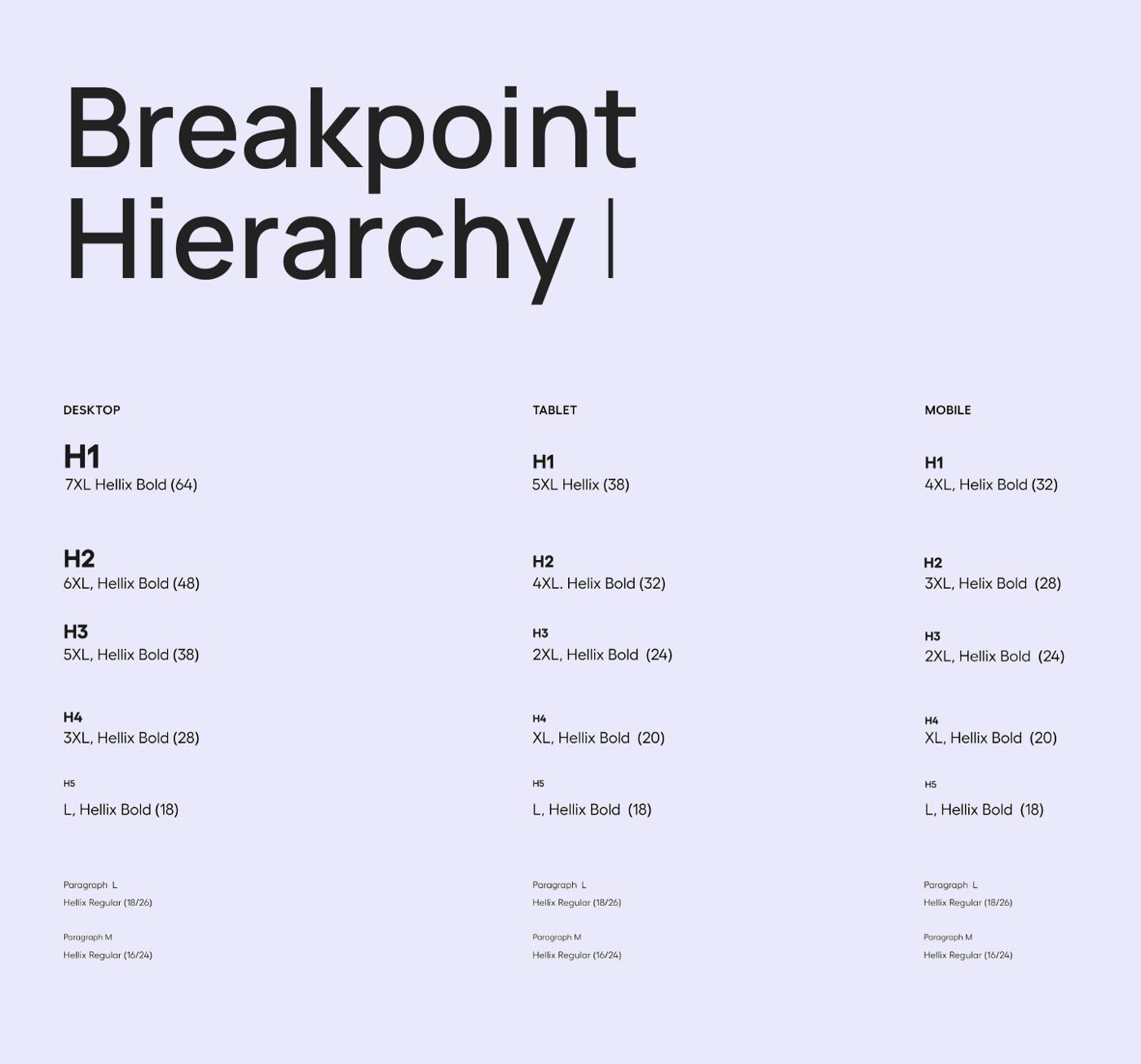 Breakpoint hierarchy.
Finishing touches.
We’ve made significant progress from website typography that only covers one project at a time to a system that can be used for all our future products, including platforms and even mobile apps if necessary. It’s not difficult to build a typography system that meets all your needs from scratch, as long as you keep in mind three main things: an adequate number of headers to cover all cases, logical line-heights, and a strong structure for breakpoint hierarchy.
A well-thought design system is something that will make your life better and help you create great design projects.


