At Noomo Agency, we are constantly exploring new technologies to enhance user experience. Recently, we have been investigating the opportunities to implement AI (Artificial Intelligence) to improve the Telehealth experience for both patients and healthcare providers.
Virtual healthcare presents numerous benefits, including enhanced access to care and increased efficiency. However, it also presents challenges, such as the absence of personal interaction and issues with trust. Let’s dive deep into details and check how we solved these challenges while creating Telehealth product.
Understanding Barriers in Telehealth Adoption.
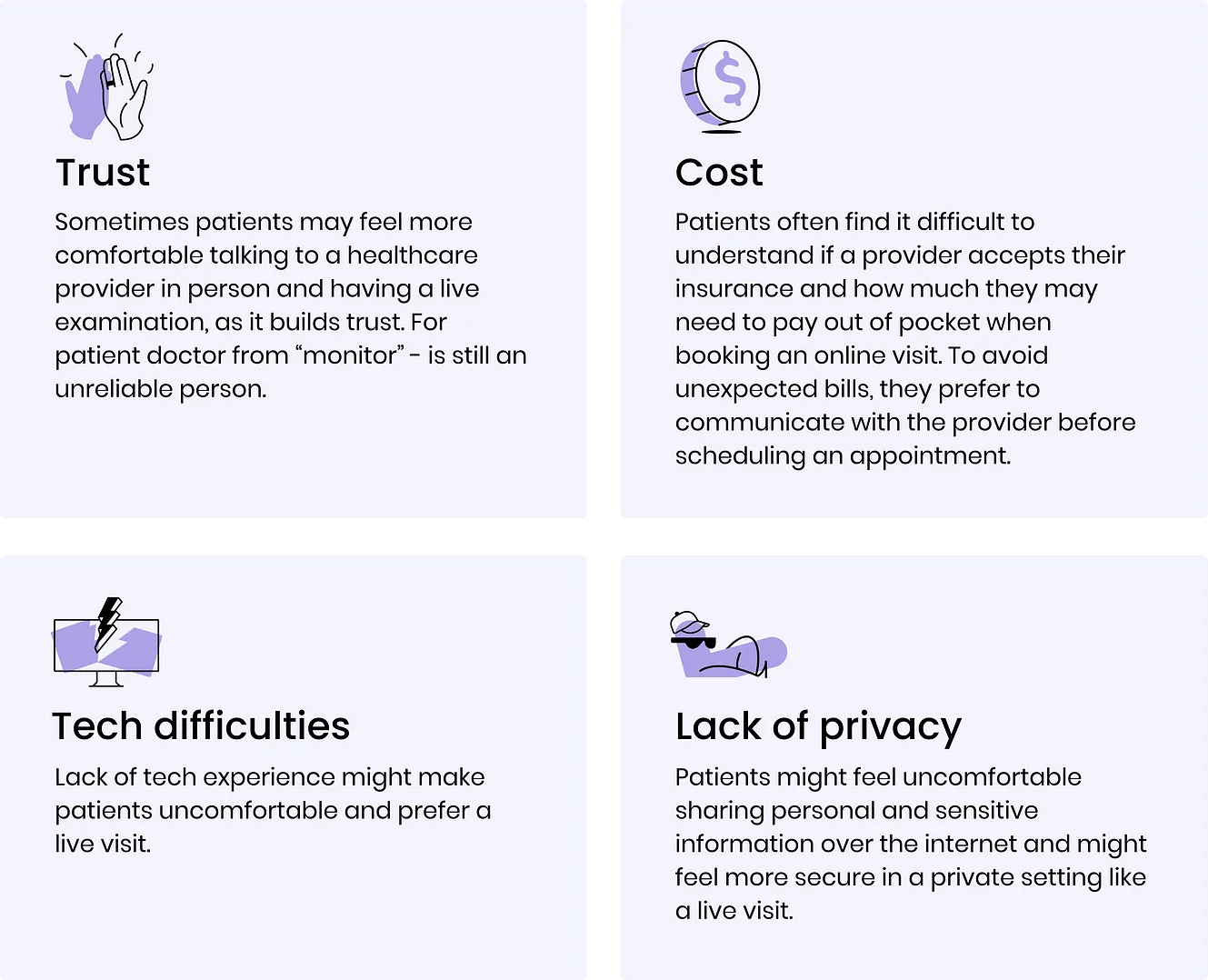
A lot of patients still prefer in-person visits over virtual consultations due to various reasons such as lack of trust, technology concerns, and personal preference.
 Immersive design for AI telehealth application featuring modern technology and best practices.
In addition to this, there are some general issues that healthcare patients often encounter:
- Insufficient clarity on insurance coverage.
- Insufficient clarity on insurance coverage.
- Difficulties in understanding overall health status.
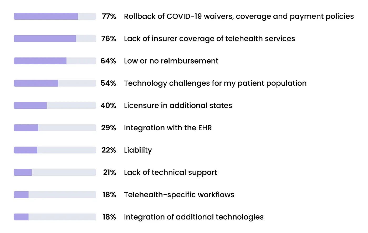
On the other side, Doctors also face a lot of problems in their online practice:
 Healthcare provider challenges in virtual practice including time management, documentation burden, and patient communication
It’s clear that both sides: patients and providers face a lot of challenges when it comes to accessing and managing healthcare processes. Many of these issues can be improved with clever design solutions. Let’s check, how we solved it.
Our goals.
Our challenge was to create a product that would make life easier for both patients and providers. Such a product will provide a transparent process for managing all information, and ensure that the information provided is trustworthy and easy to understand.
We concentrated on the main problems that we aggregated from our research:
- Unclear and non-transparent process of treatment.
Beginning with unclear information about insurance coverage and the specific aspects of treatment it includes, and culminating in an overall confusing treatment process, patients may face challenges in understanding the next steps, required medication, preparation for lab work, and the overall cost of their treatment. - Lack of confidence.
This is also a crucial aspect in healthcare, particularly in virtual health, as patients need to feel secure and protected concerning their sensitive data.
All these challenges require a balanced and optimized product design solution, as this is a particularly intimate and sensitive area of the product. Therefore, we have conducted extensive research and employed diverse approaches to addressing various issues related to interface design.
Our ultimate objective was to increase patient adoption of telehealth as the primary mode of treatment, enhance the quality of service, and foster overall loyalty to telehealth.
Product design process.
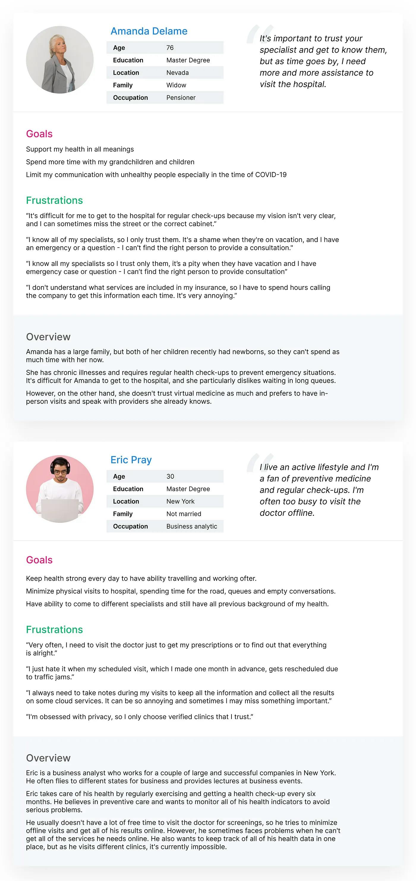
After conducting initial research and user interviews, we developed personas that focused on two main patient groups: tech-savvy and young individuals, as well as non-tech adult individuals. Other groups of patients fall somewhere in between these two categories and exhibit goals and challenges that align with one of these groups.
 User personas for telehealth app showing tech-savvy young users and non-tech adult patient segments
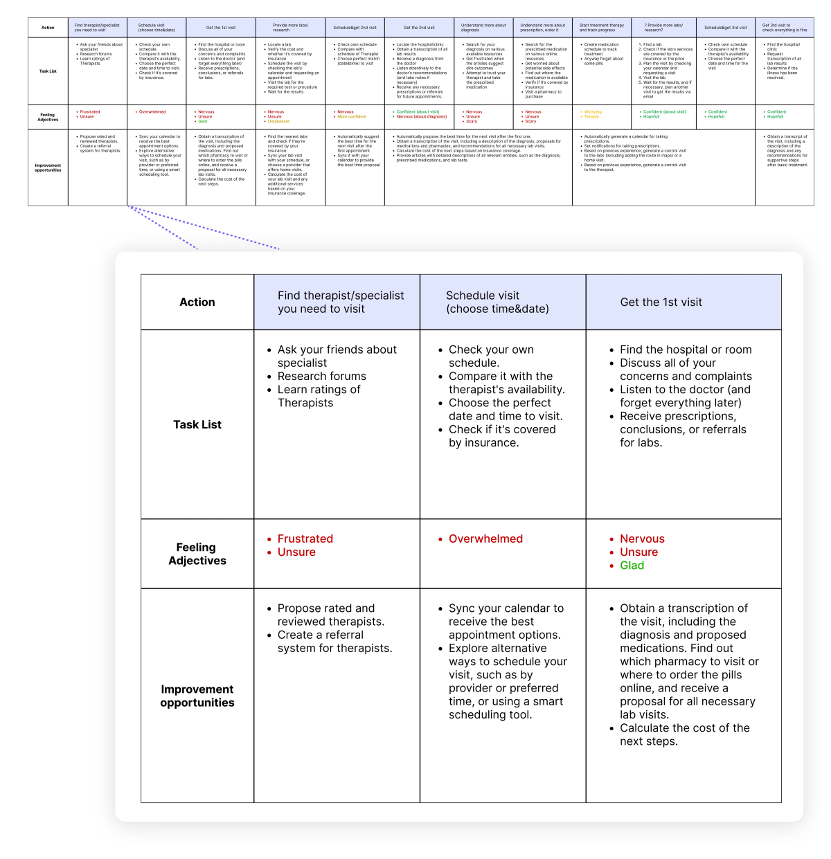
As the next step, we developed a Customer Journey Map (CJM) to gain valuable insights into the real-life treatment process. This included mapping out the entire journey from experiencing initial symptoms, seeking the right provider, scheduling appointments, and completing follow-up tasks such as lab work, medication prescriptions, and adherence to the therapist’s instructions. The resulting map encompasses all stages, tasks, and emotions, and identifies opportunities for improvement in our product.
 Customer journey map for telehealth showing patient touchpoints from symptoms to treatment completion
We conducted usability studies to verify our hypothesis and clarify all details and parameters. Now let’s take a look at the patient’s perspective and what challenges they faced:
- One of the most challenging aspects is finding the right healthcare provider or specialist. Patients often spend a significant amount of time asking friends, checking online communities, and reading Google reviews in their search for the ideal healthcare professional.
- One of the most challenging aspects is finding the right healthcare provider or specialist. Patients often spend a significant amount of time asking friends, checking online communities, and reading Google reviews in their search for the ideal healthcare professional.
- The next step is getting the diagnosis, which may sound scary. But after researching online, it may seem even scarier. You need to buy medication and start treatment but are worried about the cost with insurance. It might require waiting for your next paycheck. Plus, there are questions about where to get the labs done, and the hope to have it all sorted in one day, but unsure if that’s possible.
Sure, we’re describing an unlucky and suspicious person here, but imagine such individuals exist, and even more so, the majority of people have faced at least one of these problems at some point in their lives.
Let’s move forward. Based on the stages we highlighted in the CJM, we have built the product structure for the MVP, covering both provider and patient perspectives.
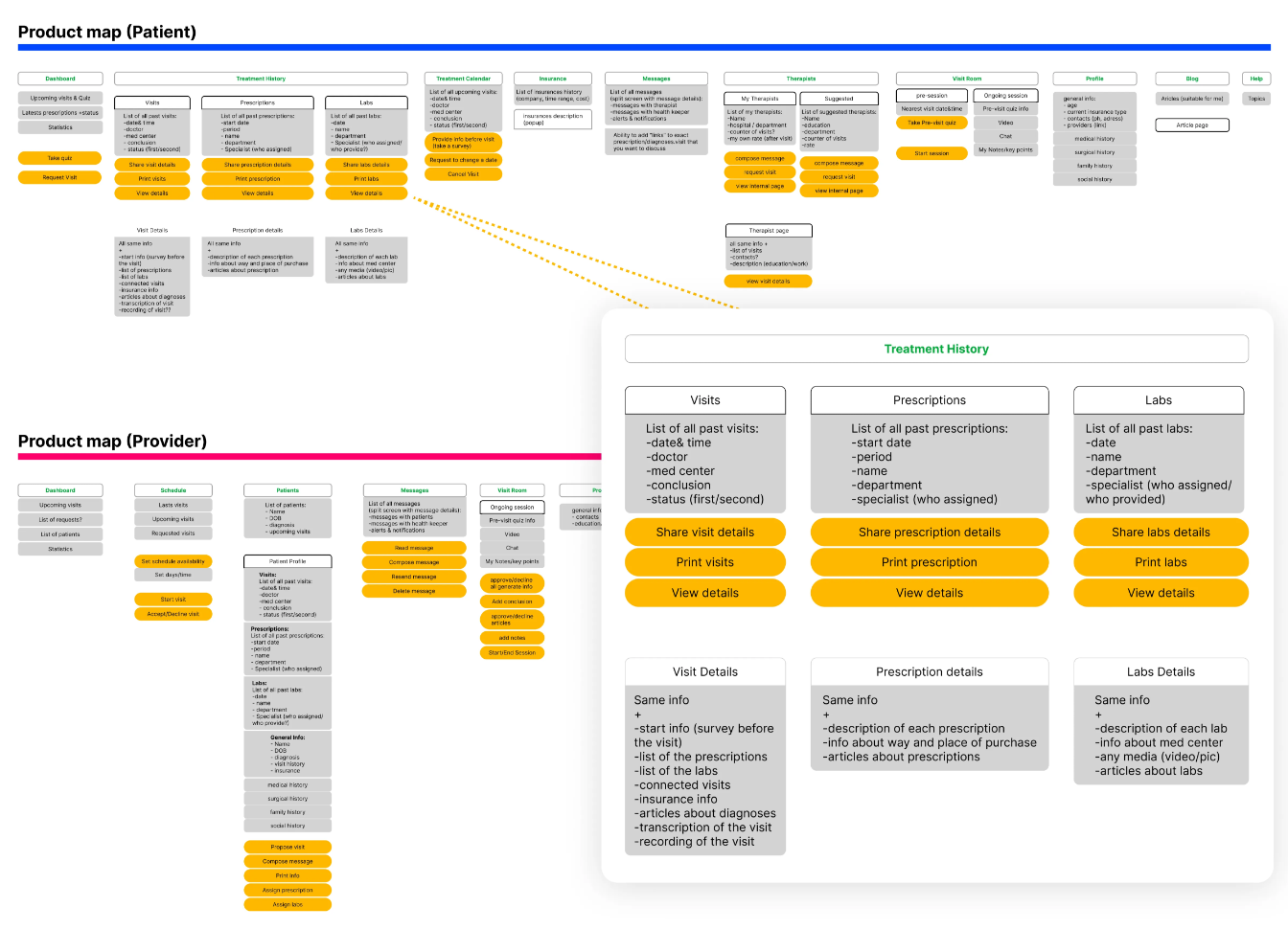 Telehealth MVP product structure covering patient and provider workflows with AI integration points
Here, we have highlighted all the main flows and actions that users can take, while also placing additional emphasis on providing information to patients to help them better understand their diagnosis, and to providers to gain insights about the patient’s condition.
Design solution.
As a result, we have formulated the scope of basic abilities and features of the product and created UX and UI design for an cross-platform application that will cover the needs of patients and healthcare providers. Let’s focus on the most interesting user flow of Virtual Visit and the subsequent steps.
Improving efficiency by the involvement of AI technologies.
The involvement of AI technologies can significantly improve the efficiency of healthcare providers and enhance the patient’s understanding of their treatment plan. The use of Artificial Intelligence in the design of healthcare applications can simplify data population and analysis and present information to patients in a more understandable and user-friendly way.
In the first stage, AI technology can collect information from the conversation between the patient and healthcare provider, including patient complaints, diagnosis, labs, and prescriptions, and auto-fill them quickly for the provider. This streamlines the therapy session, allowing the provider to focus on the most important aspects and verify and supplement the conclusions rather than spending time on redundant data entry.
Moreover, AI can improve patient experience by minimizing the waiting time for visit results and providing them with the most reliable information about their treatment plan. This enhances the patient’s understanding of their condition and fosters informed decision-making.
Here, you can see how Artificial Intelligence is utilized in the design of healthcare provider web app interface.
In terms of design, Artificial Intelligence can be utilized to create more user-friendly and intuitive interfaces for both healthcare providers and patients. For example, AI can assist in creating personalized treatment plans based on the patient’s medical history, improving communication between healthcare providers and patients, and simplifying the navigation of the application.
When creating the UX and UI design for this application, we focused on navigation and content. We made sure that users could easily find and understand all (sometimes confusing) health information, from visit summaries and diagnoses to prescriptions and next steps.
So, how do we address the issue of transparency and trust for patients? We have chosen to communicate with them in a clear and verified manner. By collecting articles from reputable professionals on various diseases, diagnoses, labs, and medications, we can offer the most valid and useful information, as well as reliable pharmacies and labs.
In presented Telehealth app, patients can find everything they need to know in the most relevant, verified, and expedient manner. This includes details about their diagnosis, the location of labs, and the schedule of the most convenient and cost-effective pharmacies. This approach not only saves patients time and frustration, but also provides a comprehensive service cycle, ensuring they are informed about the next steps, screenings, and treatment costs.
Solving issues for non-tech users through proven usability practices.
While using AI in application certainly helps eliminate unnecessary actions, it requires the right structure to be truly effective. Drawing from real-life experience, we have divided the entire process into stages, from finding the right provider to collecting the patient’s medical history, conducting the visit, and managing post-visit steps such as scheduling labs, purchasing prescriptions, and tracking medication usage. At each step, we provide patients with relevant information and limited options to choose from, without overwhelming them with unnecessary choices (keeping in mind the paradox of choice).
Our goal is to simplify the user experience, so that patients do not need detailed instructions at every stage, but rather have access to the most relevant information and options.
Adding clarity on health insurance coverage.
One of the most challenging aspects for patients is understanding health insurance information. Questions like how much they need to pay for the visit, labs, and prescriptions, how costs may vary at different pharmacies or laboratories, and what the total price of their treatment will be, can be confusing. In the app, we provide comprehensive information about expenses and insurance details to make the process transparent and help patients feel confident. By ensuring transparency, patients can understand the cost of each visit or procedure, what is covered or not covered by insurance, and how it impacts the overall cost of their treatments.
Assistance for users on each step.
We ensure that patients are notified of every operation that is performed and assists them in taking the next steps as easy as possible. This includes sending notifications, adding visits to their preferred calendar (through integrations), and generating routes on the Maps app for directions to the lab or pharmacy.
These integrations are designed to make life easier for users (patients), eliminating the need for copy-pasting information to other apps as we have taken care of it already.
Our design solutions encompass a range of features, including easy navigation, clean user interface which follows the best usability practices, comprehensive notifications, and clear on-screen information, as well as AI-powered personal assistance for tasks such as writing and information retrieval. These components work together to provide a smooth and efficient interaction for both patients and providers, ensuring a seamless user experience on both sides.
Boosting Patient Trust.
Nearly all aspects of the app have an impact on patient trust in Telehealth and virtual care. Features such as provider reviews, clear and transparent information about treatment, guidance on the next steps for each situation, and open payment and insurance information help patients feel more confident about the treatment process. Even if a patient has not previously received virtual therapy, the detailed information and technical support provided by the application can help increase trust in virtual treatment. In summary, solving the problem of patient trust requires not just one specific solution, but a combination of smaller, separate solutions that each play a role.
To summarize.
Creating design for a Telehealth as well as for other healthcare applications, there are several important things to keep in mind:
- User experience is a critical aspect to consider when designing a healthcare application. It is important to provide a seamless and easy-to-use experience that covers the needs of both healthcare providers and patients. Clear instructions and feedback, as well as easy access to relevant information, are crucial elements that can help create a great product.
- User experience is a critical aspect to consider when designing a healthcare application. It is important to provide a seamless and easy-to-use experience that covers the needs of both healthcare providers and patients. Clear instructions and feedback, as well as easy access to relevant information, are crucial elements that can help create a great product.
- Accessibility and compatibility. Healthcare apps should work seamlessly on various devices and platforms. Moreover, it’s essential to guarantee that users with disabilities can access the app with ease.
Telehealth represents a significant step forward in making healthcare more accessible in a wide range of situations, such as urgent medical needs, consultations with specialists, and secondary opinions where relevant patient information is readily available. These cases constitute a significant portion of healthcare challenges faced today.
Our aim as designers is to continually improve products and services by experimenting with new technologies. Artificial Intelligence is one such technology that we have been exploring to enhance our design solutions.
By leveraging AI, we aim to simplify complex data population and analysis processes in healthcare applications, as well as present information to patients in a more understandable and user-friendly way. Our ultimate goal is to improve user experience and elevate the quality of products we deliver.


