

Battalion Website
Client
Battalion
Deliverables
Website design and development
Results
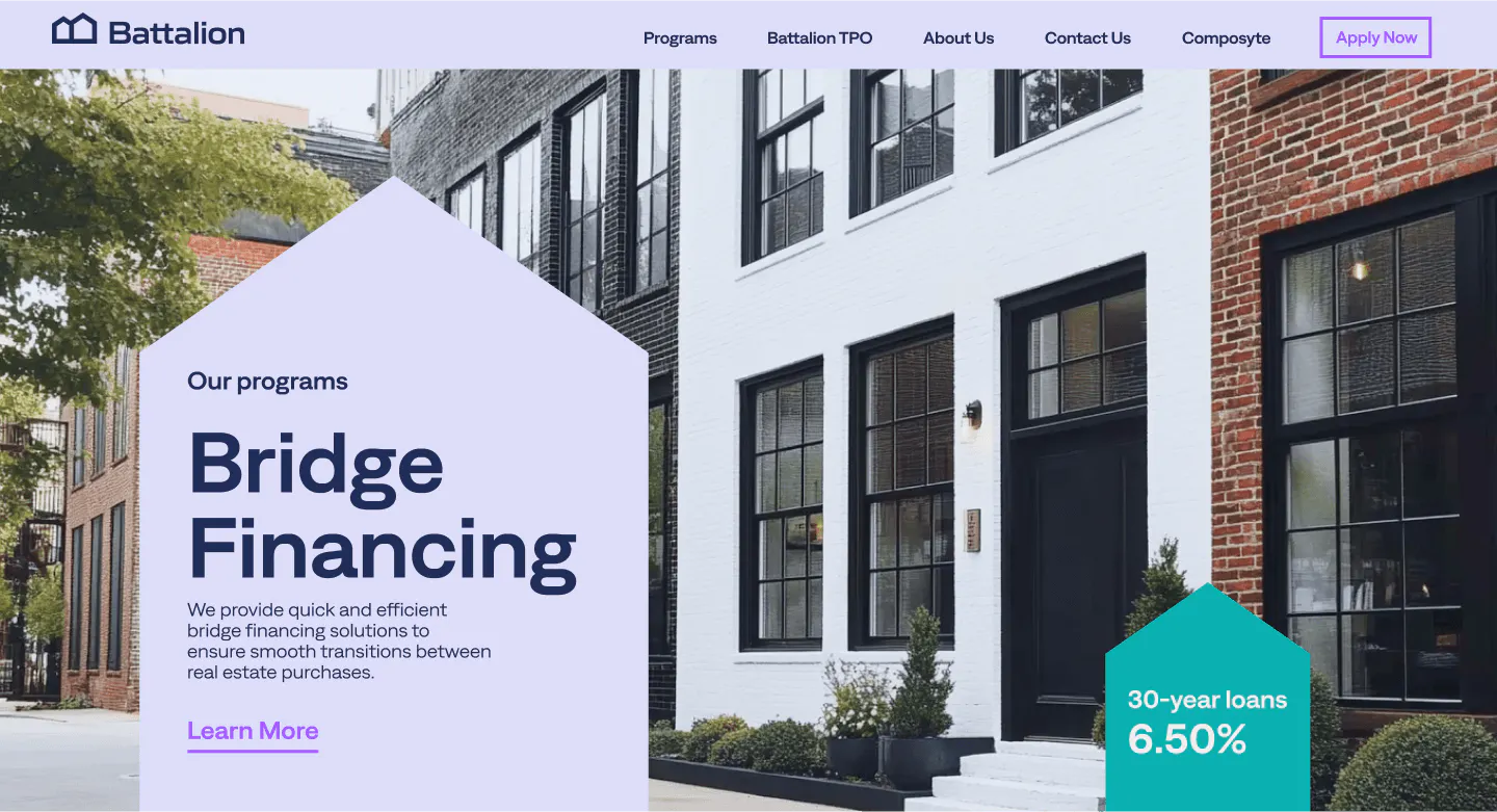
A sleek, intelligent web experience supporting Battalion’s mission to help real estate investors scale with speed, transparency, and confidence. The redesigned platform sharpens the brand’s positioning, simplifies complex workflows, and builds trust through clarity, confidence, and forward-thinking technology.
MORE INFO View Website
Redefining lending for a new generation of real estate investors
Battalion is a fintech company on a mission to streamline property financing. They empower real estate investors with fast, frictionless access to capital—backed by smart tools, real insights, and a human-first approach. But as competitors flooded the space with templated experiences and slow response times, Battalion needed a digital presence that matched their speed, clarity, and innovation.
We partnered closely with their team to create a modern website that not only communicates what makes Battalion different, but also feels like a true extension of their product promise—decisive, intelligent, and outcome-oriented.
Visual identity rooted in motion
To bring Battalion’s brand to life, we developed a distinctive 3D visual system—anchored in the shape of a house, a symbol that connects directly to the company’s mission. This base geometric form became the foundation of the graphic language across the site.
Smooth on-scroll 3D animations add a sense of depth and movement, reinforcing the platform’s dynamic and scalable nature. It visually mirrors the investor journey: forward-moving, evolving, and built on solid foundations. Subtle transitions help communicate clarity and speed, echoing Battalion’s promise of outcome certainty and long-term partnership.
Built around trust, tech, and transparency
The design and messaging strategy was grounded in conversations with internal stakeholders, deep competitive analysis, and value mapping workshops. We aimed to distill complex lending workflows into something intuitive, while maintaining the boldness and confidence investors expect from a partner in high-stakes deals.
Every layout decision starts with the house — a single geometric form that drives the entire visual language of the site. Depth builds on scroll as 3D elements unfold with the story, while generous white space and strict grid discipline keep complex lending content feeling light. Typography does the heavy lifting: bold, confident, and stripped of decoration, supported by motion that's used sparingly and deliberately — guiding the eye instead of distracting it.

Clean surfaces, sharp edges, and precise transitions echo the certainty of a closed deal, while interactive blocks turn value propositions into moments you can feel, not just read. Underneath it all sits a modular design system built to flex — new pages, new products, same visual logic.

Let's TALK ABOUT YOU, YOUR COMPANY, YOUR PRODUCT, AND YOUR GOALS.
WITH US IT HAPPENS.
WE WOULD LOVE TO HEAR FROM YOU.
Email.
hello@noomoagency.comLet’s grab some coffee.
We are based in Los Angeles but often come to San Francisco ☕